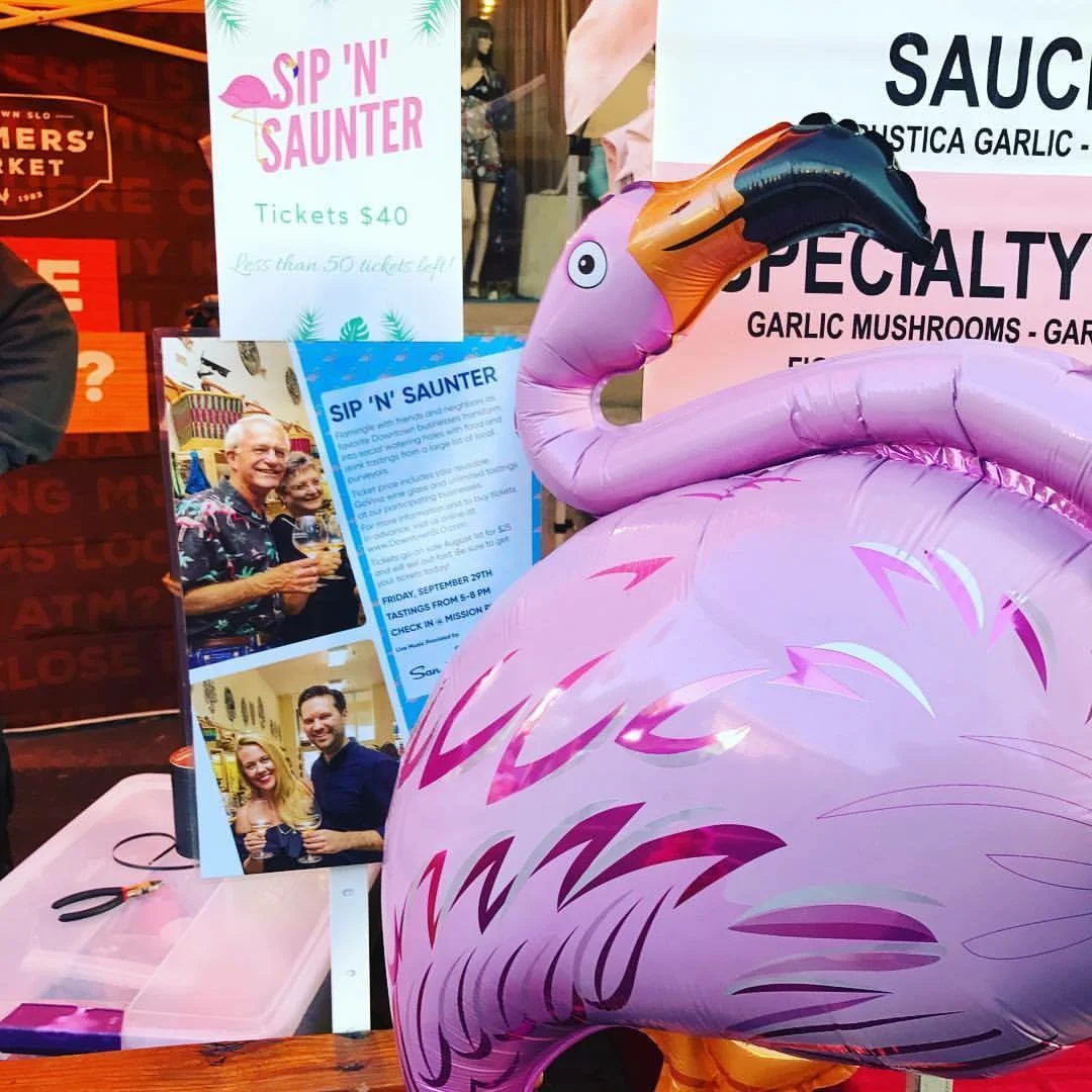
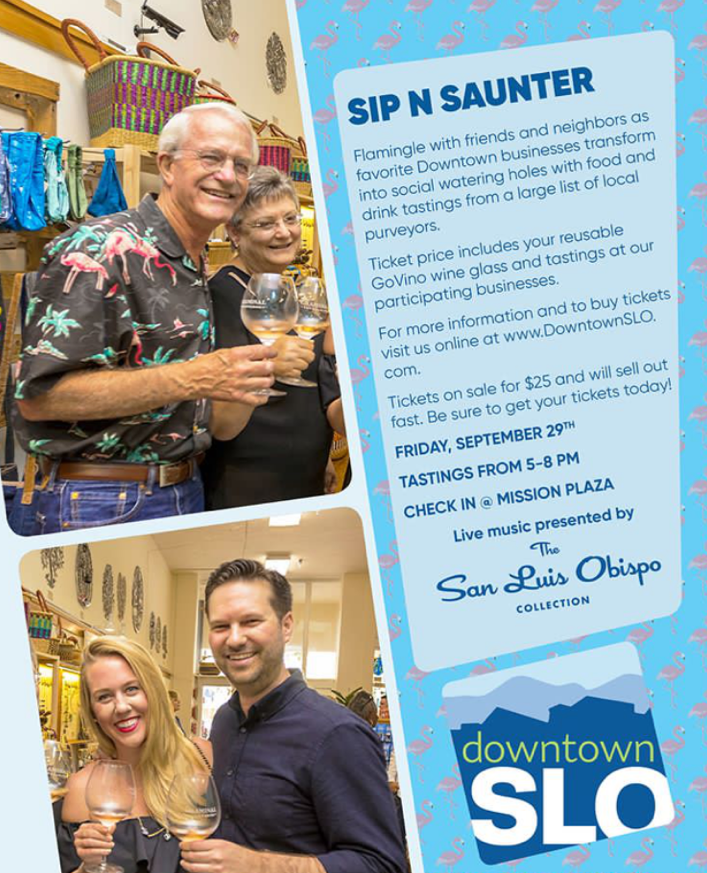
Friday evening, September 29th, Downtown SLO kicked off their inaugural Sip 'N' Saunter event which brought together the very best of SLO's local businesses for a great night out on the town. Our favorite wineries, breweries, and restaurants partnered up with local retailers including us here at Just Looking Gallery. We had a wonderful time working with our good friends from the savory and iconic Mee Heng Low Noodle House and Central Coast Brewing who's home-crafted, mouth-bubblin', bottle-poppin' brewskis made the gallery a stop on everybody's list! From 5 to 8 pm couples on a date, parties from work, large groups of friends, locals and visitors packed downtown for a memorable night of SLO-style fun!
Gary Myers Feature
Since 2012, Just Looking Gallery has been fortunate to work with the extraordinarily talented Gary Myers whose bold colors, dramatic textures, and depth of meaning make an instant impression on anyone who walks through our doors. Gary's technique has an unmistakable effect on his work which makes his paintings truly unique. We were very excited to find out that Gary Myers and his work was recently featured in the summer edition of Acrylic Artist magazine. We wanted to share the article with you which does a great job articulating not only the technical aspects of his work but the intensive thought he puts into each piece and the stories behind the paintings.
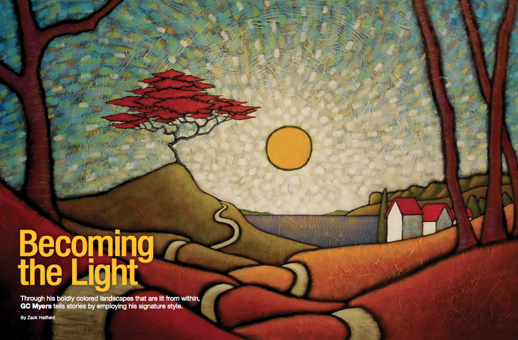
Becoming the Light
by Zach Hatfield
For GC Myers becoming a painter was an accident. Or rather, it was because of one.
Over the years Myers had tried his hand at a number of artistic ventures from airbrush painting to leather working. Most recently he was exploring woodcarving as a vehicle for creative expression, but nothing was solidifying, until the accident. In his early thirties, while building his house in upstate New York, he fell off a ladder, plummeting about 16 feet to the ground. He knocked his teeth out and fractured his wrist. “I was a mess for awhile,” he admits. After the fall, he turned to painting as a way to aid the healing process. Using old airbrush paints, but applying them with a brush, Myers began painting. “I attached a brush to my cast and started painting; something clicked. The colors that had always looked muddy to me in the past were working,” he recalls. “I was immediately drawn in, spending every free moment painting. One step forward kept leading to the next one. I became obsessed.”
A year passed, and Myers kept creating his art even as he continued to build the house he still lives in today. He launched his career when a local gallery owner offered to critique his work. Lugging in a crate of paintings, the owner of the gallery asked one question after seeing his paintings: Where the heck have you been? Myers was in a group show soon after that, and then had his first solo show.
Although he’s never had any conventional art training and has only taken a single art class—a drawing course he describes as a disaster—Myers has made a life of doing what he loves. After more than 50,000 hours spent in the studio, Myers says his one goal is to make art that he finds exciting. If he excites others along the way, that’s even better.
The Artist's Perspective
You won't mistake a GC Myers painting for someone else’s. Over the years, he’s shaped his style with a recognizably warm palette and recurring imagery. Many of his landscapes are rinsed with a sepia luminosity, as if he incorporated pieces of evening sunlight onto the canvas itself. Hallmarks of Myers’s work include villages of white cottages with red roofs and a single red tree amidst sprawl- ing pastures; symbols whose meaning he prefers to be interpreted by the viewers. Commentators frequently compare his paintings to stained glass, and rightly so; it takes a lot of skill to make it appear as if soft, medieval light is pouring through the canvas from the other side.
The modest artist says his sense of perspec- tive derives from what he describes as a sense of rightness. “It’s hard to explain, but it’s simply my innate ability to see something and just know the perspective is off. It can be a horizon line in a paint- ing or a line in a three-dimensional piece of art,” he shares. “How lines move, intersect and relate to each other and the entirety of a piece, be it a painting or an abstract sculpture, is either visually appealing and right or simply doesn’t work.”
This ability to understand when perspective is pleasing is important for an artist who makes landscapes that are emotionally based, not representationally accurate. He paints not from a photograph or looking out a window, but from his imagination. Still, he sees this sense of rightness as pivotal. “One stray line can ruin an entire painting,” he says. As evidenced in a quick study of his work, lines are fundamental in his approach to perspec- tive. Like many of Vincent van Gogh’s landscapes, Myers employs lines to hold in his brilliant, Fauvist colors. This allows his trees, roads and suns to appear bolder and, simply, more there. Myers is in uenced partly by 19th-century Japanese wood- cuts, and perhaps the occasional bonsai-looking tree in a painting is a nod to this inspiration. Often, Myers will foreground a tree or a house and subtly vignette his canvases in darker colors to provide a sense of depth.
Crucial to orienting a speci c perspective is Myers’s choice to paint mainly with a single brush—“as big a brush as I can,” he admits. This tactic, though it may seem limiting, actually enables him to create a more democratic focus. Everything is accorded, roughly, the same specificity. As a result, viewers aren’t drawn to particular parts of a painting more than other areas. Rather, their attention is cap- tured by the entirety of the landscape. This effect is easily understood when looking at The Internal Landscape (page xx), a massively scaled vista of golden valleys, sun- ecked water and corduroyed plains. The eye wanders across the work—which measures 41⁄2 feet x 7 feet—but isn’t exactly drawn anywhere in particular. This is intentional and grants the entirety of the painting a splendid presence.
The Trick to Achieving Texture
Myers has a unique approach to texture. He explains that when he’s giving advice to novice painters, they often think that by texturing his landscapes, he’s shaping the gesso and paint to conform with the subjects he’s depicting, like texturing paint to go in the same direction a eld slants on the canvas. But this rarely works, Myers cautions. “Texture has to be independent and cha- otic. Once you try to overthink it or try to force it, it has no organic feel,” he says. “And that’s what I’m looking for.” Instead of focusing too much on treat- ing his textured acrylic like the objects he’s painting ( elds, leaves, houses), Myers lets his textures play against what he’s depicting in the work. The technique can be seen in paintings like Shambhala (page XX), in which scrapes and wrinkles on the canvas are uniform across the greenish sky, mountain range, sky-blue lake and rolling knolls.
Let There Be Light
When it comes to imbuing his canvases with light, Myers starts with darkness. For a work like The Internal Landscape (page XX), he begins by layer- ing the entire canvas with gesso, then black paint, and then red oxide for the underpainting. He uses Liquitex Heavy Body and Golden Fluid paints, and Loew-Cornell hog bristle brushes when working with acrylic paint, but he’ll sometimes trowel or run his ngers through the gesso. Because he starts with a darker base, the colors appear more vivid against the dark background when he begins to paint his landscapes. The technique occurred to him while visiting the Museum of Fine Arts Boston, where he became trans xed by the work of post-Impressionist painter Paul Gauguin. Upon close inspection, he noticed speckles of vermillion coming through the other hues. Myers notes that colors appearing in paintings of natural land- scapes don’t have to actually appear in nature, and the paintings he studies at the museum reinforce that belief. By layering red oxide—a pigment that helps lend his canvases their rusty glow—over the black paint, Myers creates a red Rothkoesque, brick plane that activates the colors on the surface.
For paintings like The Way of the Master (above, left) and Cast Your Shadow (page xx), the sunny skies are rendered with shapes reminiscent of sequins of various pigments. Myers admits that many of the colors he used for these skies aren’t immediately visible, but that they contribute a great deal in creating the texture and atmosphere he needed. For pieces that involve water, such as Linked (page XX), a vision of two islands connected by a rope bridge, Myers works with FW Artists transparent inks, lifting color off of at surfaces with an ox hair brush. “I’m working very wet, with a lot of color and treating the process, at times, like a watercolorist would,” he shares. “I call this process of applying a lot of color and then lifting it off the surface reductive painting.” The technique reveals a washed-out white canvas surface that gives the impression of a broken dawn’s light. When employ- ing this watercolor–like painting process, he uses Saunders Waterford watercolor paper.
The Corning Museum of Glass, not too far from his studio, provides inspiration for Myers’s window-like canvases. Light is perhaps the de n- ing element of his work. “And if there is no light,” he wrote in a recent blog post, “become the light.”
Found Color
The imagined landscapes appear to take on a stained glass look and are rich in intense, saturated colors, but they never cross the line into garish and vulgar. Myers has a deep respect for color. “The main reason I was drawn to painting was I wanted to see in my work the intensity of color I saw in nature, but which I wasn’t seeing in other work, anywhere.” Myers continues by saying, “I knew that I would have to address this lack of color myself; I needed to paint the pictures I wanted to see.”
To embrace color without becoming garish, the artist errs on the side of rightness. “Boldness in color works for me, so long as it involves keeping the colors within the harmony of the color palette of the painting. Again, I refer to my own sense of rightness.” He continues by stating, “I’ve never used a color wheel or spent time studying color theory. Rather, I look for the complexities within colors. For instance, I like my greens to skew blue or orange at different times.”
An example is the sky of Cast Your Shadow (page XX) in which dozens of layers of different colors were applied to the surface, so many that early layers in the process are almost completely covered by the layers that follow—with only tiny ecks of those early colors in the sky showing. Myers explains that, “those tiny bits of other colors add a certain depth that creates the richness and interest of the piece. They also help me determine the color direction that the painting will take.”
Storytelling
Myers’s blog, Red Tree Times, has grown to be crucial to fostering a sense of community for the painter, whose rst studio was built in the far reaches of the woods. Myers has always been a remote artist, choosing to forego workshops and art collectives for the solitude of his own stu- dio. Perhaps this is echoed in his acrylic paintings that are usually unpeopled. But the blog, which he’s been posting to daily for about eight years, allows him to address themes and connect with fans, and lets his mind wander to other things in his life. “Making myself write on the blog every day gets me thinking about my work with a new perspective, and I often nd myself thinking of my paintings in relation to current events,” he says. “It also puts me in a questioning state of mind, which I consider invaluable as an artist.” Often, Myers will include biographical anecdotes that shed insight on his creations. In the unpredictable art world, entering the blogosphere is also an oppor- tunity to market and network.
There aren’t overt themes in his portrayals, but Myers insists that he’s a storyteller. “My goal is to tell stories through repetition, symbolism, mood and texture,” he says. “I let those who see my canvases project their own narratives onto my landscapes. That way, they’re more universally understood.” The recurring snaking paths, end-less horizons, red ladders—which are perhaps a subtle reference to how he began painting after his revelatory fall—and of course, those crimson trees all seem like backdrops to fables. Myers says their beholders frequently see themselves in his work, and often ascribe notions of heroism, persistence and inner tranquility to them. It all goes back to what Myers says he hopes to accomplish with his art—to achieve that unmistak- able sense of rightness. /aa
Central Coast Aquarium Official Release
Catch of the Central Coast 2017
This evening the non-profit Central Coast Aquarium will be holding its fifth annual fundraiser "Catch of the Central Coast 2017" in a mission to educate and engage the community in the care of our beautiful ocean environment. This year we are extremely happy to announce that Just Looking Gallery has been working with the Central Coast Aquarium to develop a custom image, created by the one and only Steve Thomas, depicting the aquarium and the wildlife of the ocean. In addition to a night of dining while overlooking some of the best coastal views in California, the CCA will be auctioning off the very first print of the fantastic, new, limited edition series.
We are very proud to call the Central Coast our home and were eager to work on a project depicting our local environment and beautiful wildlife. The Central Coast Aquarium depicted in the painting not only offers an exciting look at life beneath the sea, but celebrates such an important part of our community's identity. Places up and down the coast such as Pismo Beach, Morro Bay, and Avila Beach have given us timeless memories to look back on and cherish. Therefore, we are very excited to release a piece in coordination with our local CCA which perfectly captures the essence of our beautiful marine wilderness and coastal community.
More information on the Central Coast Aquarium can be found on their website along with details on the print series. The Central Coast Aquarium prints can also be purchased on our website here.
Rare Collection of Manuel Nunez Prints Available
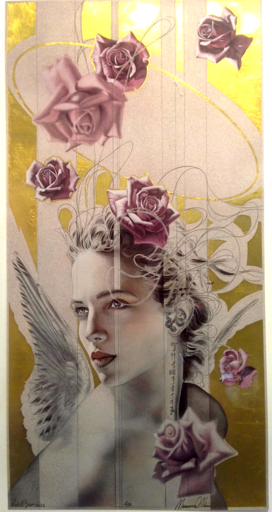
Early last year we acquired a collection of extremely rare and sought after Cibachrome prints by Manuel Nunez.
These special prints are accented with stunning 24 kt. gold leaf and are each hand signed, numbered and titled by Manuel Nunez.
What is Cibachrome?
Cibachrome is a photographic process used for the reproduction of film transparencies on photographic paper. The prints are made on a dimensionally stable polyester base as opposed to traditional paper base. Since it uses 13 layers of azo dyes sealed in a polyester base, the print has tremendous longevity and will not fade, discolor, or deteriorate for an extended time. Characteristics of cibachrome prints are image clarity, color purity, and being an archival process able to produce critical accuracy to the original transparency.
Descending P/PII 1993 - 10/75 x 19.75
Descending A/P 1993 - 21.5 x 39
What Do You Collect? Boo Boo Records Collection
It's the hunt that we all love so much; flipping through stacks of both perfectly packaged treasures and beaten tattered used sleeves still protecting that beautiful vinyl record, but when you find that special album, the one you might not even have been looking for, it's difficult to contain your enthusiasm. Steve Thomas' Newest Boo Boo Records Print celebrates those that love to collect vinyl.
In June of 2016, Steve Thomas released his first print of Boo Boo Records and we quickly learned what a big deal this small-town record shop was. We had people rushing in to pick-up their print of Boo Boo's and they would tell us stories of first dates vinyl shopping, weekly visits to their store and how this piece perfectly captured the vinyl culture. Since that first piece we've realized that Boo Boo Records isn't just a great local record shop, but that they're one of the best vinyl stores in the US! We love the friendly vibe and the passion that they continue to share with each generation that discovers the beauty of vinyl.
As Steve began to work on a new Boo Boo Records piece, he was able to collaborate with Mike White, owner of Boo Boo Records, to line out a new visual concept that captured the nostalgic feeling and eclectic quality of vinyl collecting; and of course Steve had to sneak a few favorite albums in there too! Can you spot the hidden treasures?
Art Saves Lives
A little about the mural that graces the front of our gallery; an image of which is prominently featured on our website.
Art has the power to connect people all across the world. Art tells stories, bridges gaps, celebrates our differences and reveals what we have in common. Man One grew up in Boyle Heights, LA with resilient affection for graffiti and urban street art and earned a degree in the Fine Arts from Loyola Marymount University. No stranger to the adversity caused by poverty, violence, and other social issues, Man One has developed his artistic career centered around the belief that "art can transcend cultural and socio-economic barriers, fostering understanding, mutual respect and unity among disparate peoples" (Man One Art). Widely known for his charitable events and contributions, Man One has organized local projects in LA and across the globe in an effort to educate and inspire the hearts and minds of others using the power of art.
Man One is not only one of the most iconic graffiti artists in LA, but has worked on projects all over the world. He has collaborated with major companies such as Coca-Cola, Oakley, Disney, including painting live at performances alongside the Black-Eyed Peas, Blink 182, and George Clinton to name a few. Along with these great opportunities and the work of his own gallery in LA, Man One has been a strong influence in legitimizing the value and collectibility of graffiti.
Over the years Just Looking Gallery has been very proud to work with such a talented artist who's humanitarian efforts and creative integrity pair so well with the spirit of our gallery. In November of 2013 we commissioned Man One to paint a mural covering the outside of our front wall. The mural expresses one simple and genuine message which represents everything Man One and Just Looking Gallery believe in:
Art Saves Lives.
The Art of Printing: Giclee
Giclée printing is a term often used to describe high quality and high-resolution inkjet printed fine art images. While inkjet printing was invented in the 1950's for commercial graphic printing, the term "Giclée" was coined more recently in the 1990s. Now, what's the difference between the two? The spelling! Inkjet and Giclée describe essentially the exact same process however, before the 90's inkjet had never been considered for fine art printing purposes. In 1991 a man named Jack Duganne began developing a series of fine art prints calling them "Giclée," an adapted French word roughly meaning "to spray," as a way to draw positive attention to the quality of his work and the capabilities of digital printing.
Inside nozzles of an Inkjet printer
With the rapid digital and technological advancements of the 80’s and 90’s by companies such as Adobe, HP (Hewlett-Packard), and Apple the possibilities for artists were seemingly endless. Printing became more efficient, more affordable, and more versatile allowing artists to produce a single print or a full edition of prints in a short period of time with relatively little preparation or waste. In comparison, more traditional printing methods such as lithography require time consuming preparation including plate making, or screen making in the case of serigraphy, which is often used for only one project before having to be recycled or discarded. In addition to the speed and efficiency, the Giclée process allowed artists to experiment and print on a number of different substrates including paper, canvas and even aluminum. The most attractive aspect of Giclée printing to artists is that it’s an extremely accurate and consistent reproduction process so there’s little variation throughout an edition of prints; but the real success of Giclée lies in its quality and longevity as an extremely high resolution, archival print that will stand the test of time with minimal fading or fatiguing.
Having opened our gallery in 1984, we've had the pleasure of working with a long list of incredibly talented artists to develop limited edition prints using Lithography, Serigraphy and Giclée. In 1993 we began printing the first Giclées for our gallery with artist Manuel Nunez. Over the past 25 years of printing Giclée we've been able to introduce the artwork of world renowned talents such as Tim Huhn and Steve Thomas to our collectors and offer attainable and collectible limited edition Giclée prints. Due to the efficiency of digital printing we are proud to provide many people who come into the gallery with their very first piece of artwork. Because of our ability to print high quality, long lasting Giclée prints, their work has been sold and shared around the world. It is a top priority of ours to ensure that when working with our artists to produce printed editions of their work that they are of the highest quality possible and will last as long as the memories they reflect.
Artist A Day Features Dennis Bredow
Artist A Day features a top, emerging professional artist each day, giving their followers the opportunity to discover and collect art from around the world; today they featured our very own Dennis Bredow!
From feature films to fine art galleries and even international public art events, it seems the world is beginning to figure out what we've known for years, Dennis' art is Killer Diller in Miniller!
Dennis Bredow, a Los Angeles native, studied graphic design and illustration at California State University Fullerton. Dennis has a long history as a commercial artist working on feature films and projects for Sony Pictures as a Senior Art Director. Since working with Just Looking Gallery, his retro-modern artwork celebrates the tireless optimism of mid-twentieth century America. Using acrylic, serigraphy, and found object assemblage, his bold, unique paintings offer a present-day revival of the exuberant ideals of a bygone era.
Creating "Fanfare For The Common Man"
Integrity. Pride. Dedication. Greatness. When it comes to Tim Huhn's artwork you can't help but think about these values which are represented in all of his paintings. His art-deco series, which has continued to thrive and grow for over 10 years, speaks to the hard work and persistent creativity of the 1930's Art Deco Era. Over the past two months, Tim Huhn has been diligently creating his newest painting connecting the themes of integrity, pride, dedication, and greatness within one spectacular original image. Here you will have a rare look inside the creative process and development of Tim Huhn's latest project, "Fanfare for the Common Man."
Stage 1: Beginning with the Basics
Even as a former Disney Artist with decades of illustration and painting experience, Tim starts with the basic essentials, a piece of paper and a pencil. Beginning with an idea and a central message in mind, Tim decides how best to visually represent those concepts and the subject matter of the piece through rough sketches. Then, he refines those sketches into a detailed line-drawing of what will become the finished painting.
Stage 2: Moving Forward
The pencil drawing is the foundation for each of Tim's monumental paintings, and after he finalizes the line drawing he then proceeds to colorize the image. Very attentively he focuses on one section at a time, slowly bringing the entire piece to life.
Initial Study Painting 19"x26"
With his paintings diving so deep into these powerful themes every detail is considered when evaluating how best to capture the essence of this historic time period. In this case, Tim Huhn created two different preliminary study paintings, each with their own unique color scheme before deciding on the final appearance.
Second Study Painting 19"x26"
Stage 3: From an Idea to a Reality
Ultimately, it's Tim's compositional elements of juxtaposing perspective lines to create tension, and his stark contrast of light and dark to create illumination which capture the heroic spirit and inspiring nature of Tim Huhn's original ideas. Integrity. Pride. Dedication. Greatness.
Finished Oil Painting 40"x55"
"Fanfare For The Common Man"
Play Well with Others ... A New Series by Painter David Palmer
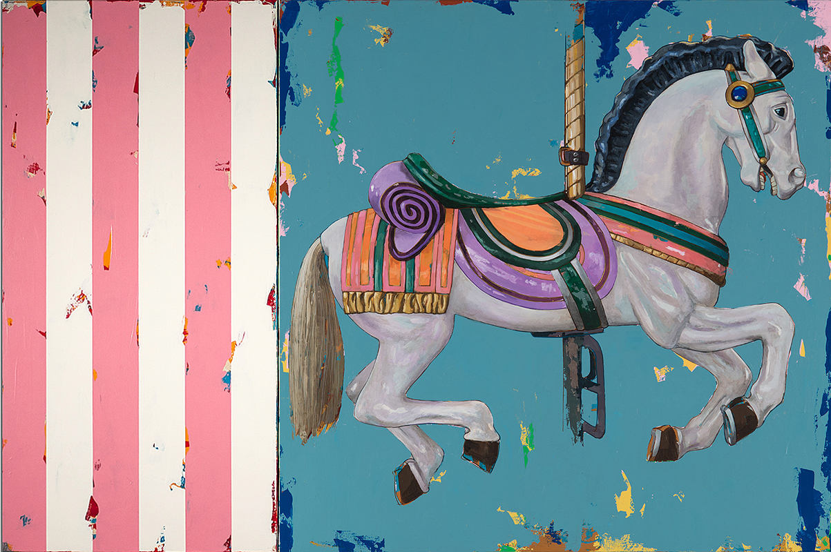
David Palmer's artwork is a rare blend of traditional painting techniques paired with Pop-Art imagery, colors and texture. His stunning and tactile paintings of Orchids, Sunflowers, Carousel Horses and Hummingbirds have been a popular showcase for us this past year; but David has begun to paint a new series of work that plays well with all of his other paintings; simple but bold, Pop-Art Stripes!
David's idea was to accentuate each of his paintings with an optional companion painting of stripes that pulled out a complimentary color. The structuring of the stripes offers a nice change of composition and format as they can be hung adjoining the main painting in any orientation; right-hand side, left-hand side, top or bottom, these Stripes Play Well With Others!
David Palmer, Flowers 6 with Blue Stripes
David Palmer, Flowers 17 with Orange Stripes
David Palmer, Horses 2 with Pink Stripes
David Palmer, Flowers 11 with Rust Stripes
David Palmer, Flowers 18 with Orange Stripes
Viva Las Vegas!
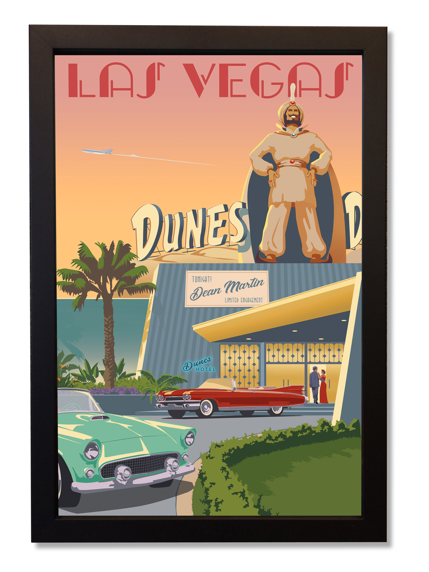
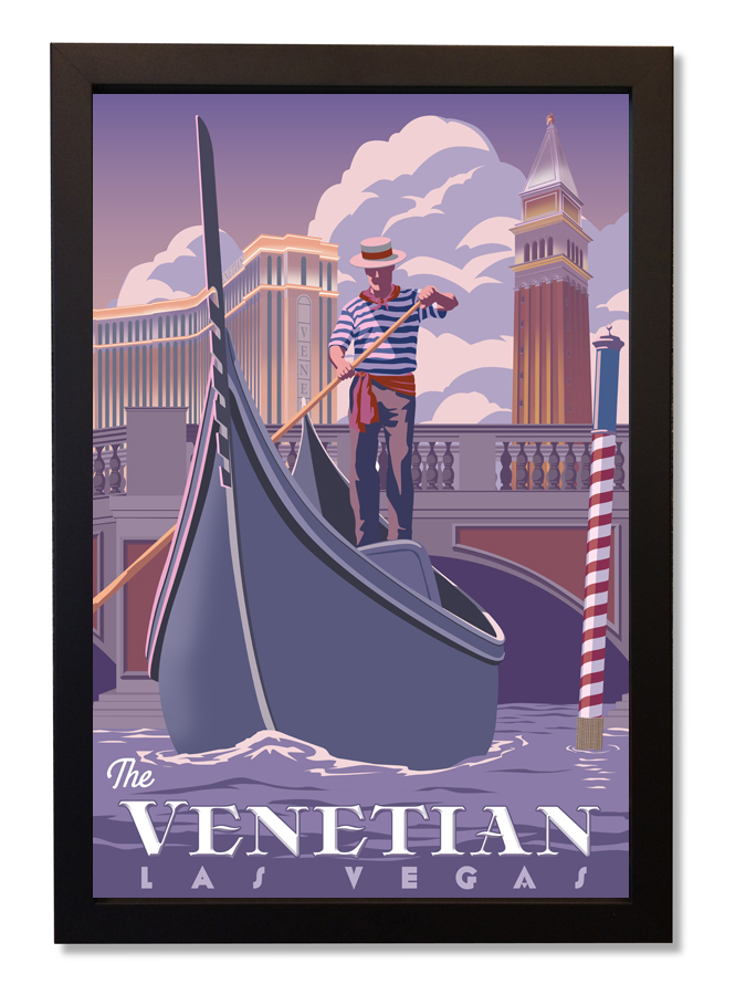
The sound of casino chips and slot machines, the glitter of millions of rhinestones covering practically nothing at all, the swagger and charm of Frank Sinatra and Dean Martin; and in spite of its heat, Vegas has a style and allure that will always remain the epitome of cool. In the Spring of 2016 we met with the owners of the prestigious Regis Galerie located in the Venetian Grand Canal Shoppes in Las Vegas. They wanted a series of Steve Thomas pieces capturing the glamour and history of Las Vegas. Beginning with a series of Vegas icons, Steve created two pieces depicting The Rat Pack and Elvis Presley paired with the iconic sign "Welcome to Fabulous Las Vegas Nevada."
Right away the pieces were a hit, but Steve had another idea, an idea to tell stories that spoke more to the coolness and style of old Vegas, Steve wanted to create a series of pieces that told the stories of Las Vegas as seen through the eyes of an Old Red Cadillac.
Peppered with other images of neon, roulette wheels, pool days and glittering casinos at night, Steve Thomas created a fantastic body of work that captures everything we love about Las Vegas.
Viva Las Vegas!
What's More American than a Summer Road Trip?!
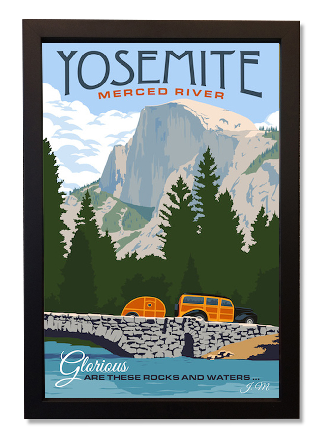
In (1903) President Theodore Roosevelt sent John Muir a letter asking to meet in Yosemite. "I want to drop politics absolutely for four days and just be out in the open with you."
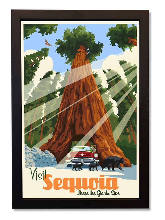
Pack your bags, get the kids, load up the car and hit the road! There's few things more memorable or more rewarding than spending the summer trekking across the country to experience some of the many iconic locations we as Americans are so proud to call home. For years distinguished artists across the country have captured the essence of these places through world renowned photographs to quintessential travel posters. Check out a few of these photos and images (including a few pieces done by our own Steve Thomas) that bring back memories of those places forever in our hearts.
Zion National Park
Mount Rushmore, South Dakota
The Art of Printing: Lithography
In 1798 a German man by the name of Alois Senefelder invented what would become a revolutionary method of printmaking known as lithography. The concept of lithography is based on using the attraction and repulsion of oil and water upon a stone or metal plate which is then pressed against a substrate, creating a finished printed image. In order to make this possible, the image must first be created in reverse (as if looking at a mirror) on the stone or metal plate. What makes lithography unique however is that the plate remains completely smooth, unlike a stamp or other relief printing techniques. Rather, the stone is treated so that the area which will be printed onto the substrate repels water and attracts oil while the rest of the plate repels oil allowing ink to be transferred only to the printed area of the substrate.
Throughout the 1800s the process of lithography was refined, allowing images to be printed in color, and became a widely used method of printing among commercial industries and artists alike. By the 20th Century the practice had become a staple for print making within the art world. Many world renowned artists of this era produced some of their most esteemed pieces using the process of lithography including Toulouse Lautrec's famous "Moulin Rouge: La Goulue" Poster, "The Bull" by Pablo Picasso, and "Metropolis" created in 1927 by Heinz Schulz-Neudamm which sold for $690,000 in 2005. Recently on display here at Just Looking Gallery were a series of vintage lithograph Mexican travel posters and two rare YMCA and YWCA lithograph posters.
"Metropolis"
by Heinz Schulz-Neudamm 1927
"Ciudad Juárez Mexico"
by Jose Luiz Sanz Magallon 1938
"Moulin Rouge: La Goulue"
by Toulouse Lautrec 1891
"YMCA Lend Your Strength"
by Gil Spears 1918
Looking at the vast history of fine art and the numerous works which have truly remained timeless, it is impossible to overlook the immense impact of lithography. It revolutionized the art world and remains a widely used practice within the print making industry to this day.
From South Australia to Oceanside, who doesn't love Wine and Koalas!
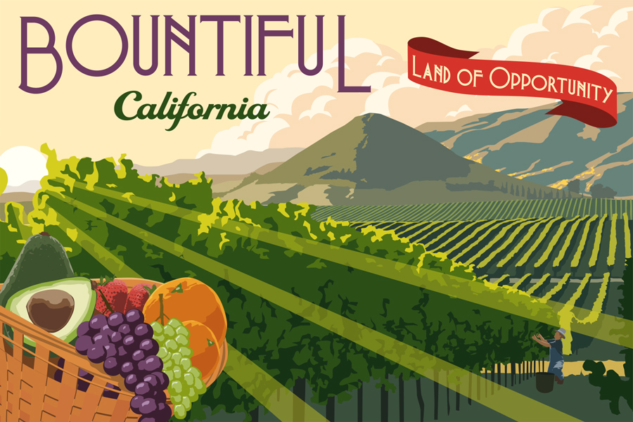
In March of this year, we sold a Steve Thomas "Bountiful California" print to a client who was opening a new Wine Tasting Room in Oceanside, California. He thought the sunlight, colors and vineyard imagery was perfectly suited to their new tasting room.
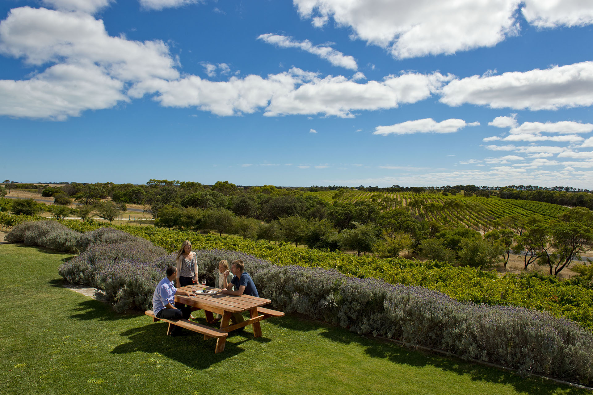
The impact of the art in the tasting room was immediate and the client called back wanting more, but this time wanting something custom! One of the great things about working closely with each of our artists is that we get to work on custom projects for our clients; often times those projects are very personal and in some ways tell their story. In this case, the client had a very intriguing story; Craig Holme, originally from Southern Australia, moved to Oceanside California with his wife and partner Julie after years of domestic and international winemaking experience. Resourcing their fruit from premium Family Estate Vineyards located in the Mount Benson region of South Australia, which the Holme family has owned and operated for over 100 years, and from the Central Coast of California, Holme Estate's wines are hand crafted using a mix of old and new world techniques.
After Steve referenced photos of the Holme Estate Vineyards and their wines, Steve came up with a clever concept of a Koala playing with a bottle of wine. The pairing of this adorable Australian icon and the Holme Estate Cellars signature bottle of wine made the perfect visual story for Craig and his wife. Steve Thomas then began to render the artwork in the distinctive graphic style of vintage French wine posters. The simplicity of the image, the colors and stark contrast made for a timeless piece that speaks to the heart and history of Holme Estate Cellars.
The Art of Printing: Serigraphy
Fairly often we get questions from our clients about the limited edition prints that we're showing, how the prints are made and what's the difference between a print that's a Serigraph, Lithograph and Giclée. So we wanted to take some time to explain these different printing techniques and how artists have used them over the years. The first technique we want to focus on is one of the most widely used methods of specialty printing in the fine art world, Serigraphy.
The principle of screenprinting, silkscreening, or serigraphy, consists in applying stencils to a screen (constructed of silk or of some synthetic or metallic material), in such a way that when ink is applied it is prevented from passing through some parts while penetrating the rest of the screen, thereby printing an image on paper placed underneath.
The key to printing high quality serigraphs is all in the preparation of the screen. The process requires an immense amount of forethought, planning, patience and often a steady hand! There are a number of methods available to prepare the screen for printing, including the use of filling-in liquid, varnish or plastic film.
The screen is then stretched across a frame and attached to a base in such a manner that it can readily move up and down, so that paper, canvas or other substrates can be easily placed and removed as required. For each impression, the substrate is placed against registration tabs to ensure that the image is printed in the correct position. After the screen has been lowered into position, the ink is poured over the masking at one end of the frame and then scraped across the screen with the aid of a squeegee.
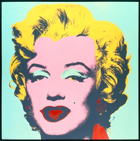
Artists all over the world for decades have used serigraphy to create some of the most recognized pieces of art we know today. Andy Warhol, known historically as one of America's most distinguished artists and a pioneer of POP Art, used screen printing to produce some of his most renowned works of art including his famous "Campbell's Soup" series and "Marilyn Monroe" images. Patrick Nagel, the late iconic artist of the 80s era, whom Just Looking Gallery is proud to have showcased for many years, reproduced many of his pieces as limited edition prints using serigraphy which have since become widely sought after.
Andy Warhol, Campbell's Tomato Soup
1 of a 10 piece series
Serigraph Print on Paper, 1962
Patrick Nagel, Texas
12 Color Serigraph, 1983
Andy Warhol, Marilyn Monroe
1 of a 10 piece series
Serigraph Print on Paper, 1967
Patrick Nagel, Just Looking
8 Color Serigraph, 1978
Over time screen printing has been highly valued for its versatility and ability to print on nearly any substrate for any purpose ranging from clothing to fine artwork. Since its invention at the beginning of the 20th Century, serigraphy continues to be one of the most popular and widely practiced methods of printing to this day.
Joe Forrester Crafted Central Coast Nostalgia
Since our friend and artist Joe Forrester's passing, it's been three years since we've had an original Joe Forrester painting showcased in our gallery, but this past week we were able to bring two of his beautiful original paintings back to Just Looking Gallery. Both of these original oil paintings on linen are in pristine condition and framed in Joe's signature, hand crafted studio oak frames.
Born in 1925, Joe Forrester grew up in Southern California and joined the United States Navy while still in high school. After serving in the Pacific during WWII on the US Navy destroyer USS Robinson, Joe Forrester enrolled in the Jepson Art Institute. Majoring in Illustration and Studio Painting, Joe studied and worked under a celebrated staff of nationally recognized instructors. Graduating in 1949, he began his career as an advertising art director. After working for several Los Angeles based advertising agencies, he retired as Vice President, executive art director of Foote, Cone and Belding of Los Angeles. Retiring to the Central Coast of California, Joe began to paint the natural landscape that surrounded him. Joe always found timeless beauty in the quiet forgotten barns of the Central Coast and these two pieces capture something nostalgic for us. These originals showcase his unique painting style with his extraordinary atmospheric perspective and his meticulous attention to detail. Cheers to an exceptionally talented painter and gifted story-teller that will always hold a special place in our hearts and our gallery's history.
Cal Poly Proud, Introduce your new home to your Forever Home!
Congratulations to all of our fellow Mustangs this Commencement weekend!
If you're looking for the perfect gift for a Poly Grad, we have it! This beautiful limited edition Cal Poly print by world-renowned artist Steve Thomas is available in Downtown San Luis Obispo at Just Looking Gallery!
Students may not always have that 30,000-foot-view to realize how momentous this point is in their life, but graduating from Cal Poly San Luis Obispo is a significant moment in their lives, and one that they'll look back on and be proud of for the rest of their lives. Fortunately, parents do understand how significant this moment is in their children's lives and this limited edition print of Cal Poly by Steve Thomas makes for an incredibly meaningful graduation gift as it captures everything we love and hold dear about our time at Cal Poly San Luis Obispo. #CalPolyProud
Dennis Bredow Delivers Again
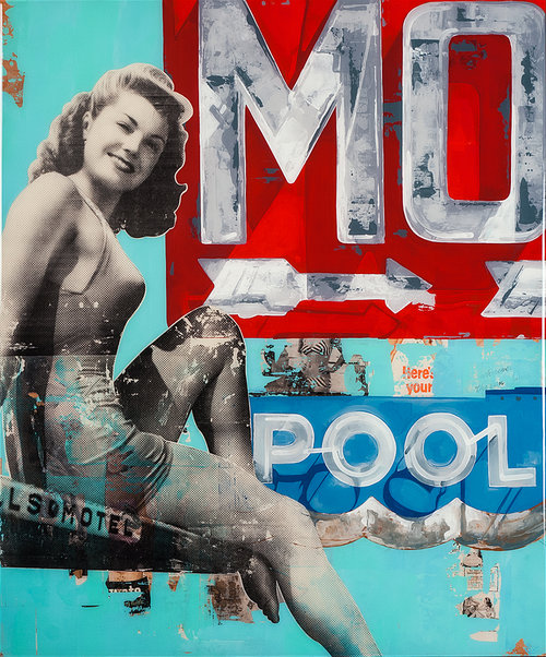
Over the weekend the one-and-only Dennis Bredow stopped by to deliver his latest original paintings, including the final piece of his killer Gun Control Series and a bold vintage single right in time for summer. His work is a unique combination of retro and contemporary, sexy and fascinating, complex and simply satisfying, and continues to amaze anyone who walks into the gallery.
When it comes to Dennis, he simply loves doing what he does best. From beginning with a basic concept, to the precise layering and texturizing, and finishing with his iconic resin coating, Dennis spends hours on top of hours to make sure everything is done absolutely perfect. Support for his work has grown immensely over the years with his paintings often coming into the gallery one moment, and the next their being placed in someone's home.
Releasing Our New Website
For over 33 years Just Looking Gallery has gained the reputation as a premier Fine Art Gallery along the Central Coast. Throughout that time we couldn't be more thankful for all of the people, local to international, who've walked through our doors and become part of the Just Looking family.
We are excited to announce the release of our new website! With a new, clean design that's easy to navigate, our website provides more comprehensive information about the artists and artwork that we're showing, on a format that's mobile compatible, while enabling our collectors to communicate and interact with us, and purchase prints and originals directly through the site.
More Comprehensive Information. Soon You'll have a PhD in Your Favorite Artist. Each featured artwork will have multiple images posted with detailed descriptions of the art piece and we'll be regularly updating the blog with information about our artists, what they're working on and any special events we have planned.
Mobile Compatibility. Our website looks just as good on your smart-phone as it does on a desktop. Scroll, tap and zoom, our website is ready for you and your fingers to cruise our new site.
Communicate With Us. Call us your art guys, your art consultants or even your art enablers; you'll be able to get to know us even better through our blog posts and you'll always be able to use our "Contact Us" page to email or call us.
Purchase Prints and Originals. Each of the art pieces that we'll be showing in the gallery will be featured on our website, and with the brilliance, ease and security of Credit-Cards and Paypal we'll be able to make arrangements for you to buy your favorite pieces without having to put any money in a Downtown Parking-Meter! We're a very social gallery and we love it when you come by the gallery to visit with us to add a new piece to your home and collection, but we want to make sure that our website is an easy point of reference for you, so you can now easily buy your favorite art piece with incredible convenience.


