Art Beyond the Canvas

800px-Degas_3x.jpg

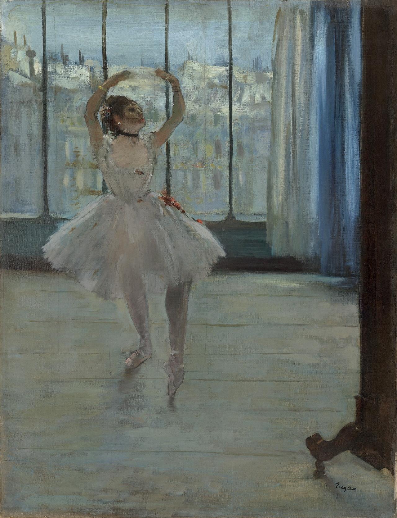
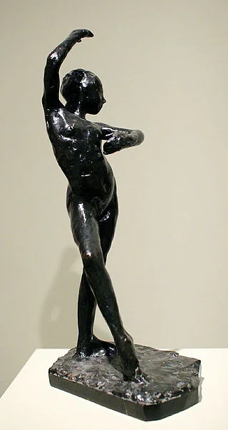
It is no secret that artists throughout history have experimented with numerous styles and mediums. Going all the way from pallet knife painting to numerous oil glaze layers. Experimentation is key in order to achieve excellence and uniqueness. In the case of Edgar Degas’ work, we can observe the exploration of photography, drawing, sculpture, and pastel, among many others. For Degas, sculpting held the same significance as drawing. They were all just “different ways of thinking, modeling one another.” Most of Degas’ sculptures never saw the light of day as he only had one public show for them during his career. These sculptures were meant to explore and discover new ways to interpret his preferred subject: Dancers. His life work and study of movement and dance hold a great degree of significance in art history and the development of the Impressionist movement on the 19th century.

“Dancer in Front of a Window”

“Dancer in Front of a Window”

“Dancer Moving Forward, Arms Raised “

“Dancer Moving Forward, Arms Raised “

Experimenting with other mediums is not just about finding one’s style or creating innovative art. It’s also about exploration of form and dimensions. Breaking out of the boundaries of a two-dimensional canvas into the space of a sculpture brings out new elements and challenges in a piece of art. Just as Degas said, sculpting is simply a different way of thinking, modeling drawing. This new perspective adds unique knowledge to an artist’s skillset, which they can later integrate into their two-dimensional work. For Degas and many others, studies, of shape and movement, regardless of the medium are essential to a developed and refined body of work.

320px-SpanishDance_c1884-DegasPC20080120-8849A.jpg

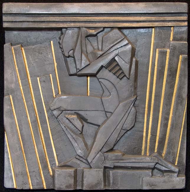
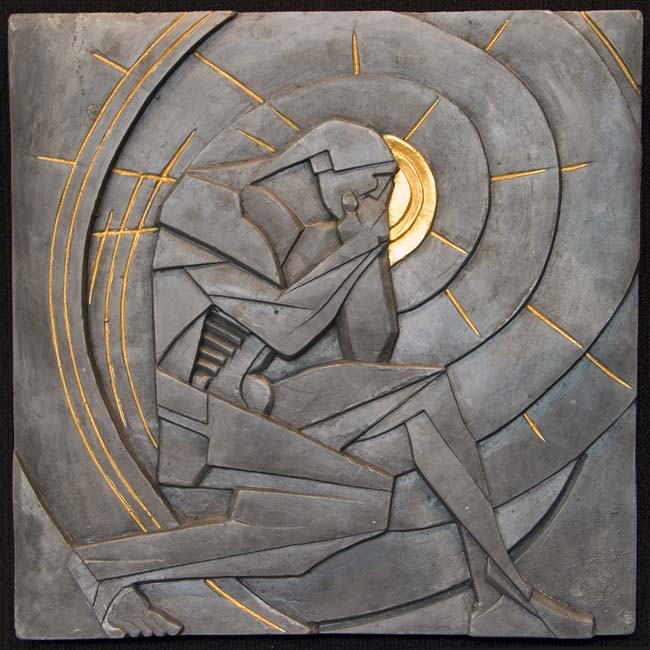
Fast forward 200 years, artists are still delving into concepts in a three-dimensional space in order to explore and observe them from a different angle, literally. One of these artist being our own and beloved Tim Huhn, whose latest project is a bronze rendition of “The Unknown Worker” one of the most powerful pieces in his body of work. This piece is currently being developed in partnership with master sculptor Phil Houser, who’s widely recognized for his commercial work in the film and toy industry. His expertise paired with Huhn’s established and compelling style could only result in a truly remarkable and vigorous sculpture.

Integrity and work ethic are just a few values which stand at the forefront of this monumental piece. These motifs are seen all throughout Tim Huhn’s body of work. Just like his artwork represents progress and the advancement of society as a whole, the development of this bronze series is a rightful and fulfilling step in the evolution of Huhn’s vision. Furthermore, its physical and strong style perfectly lends itself to a bronze portrayal, which incorporates a uniquely tangible element.

Mr. Wonderful's Mindset

Masterful craftsmanship and cleverness are just a few of the objectives that Aaron Eskridge achieves with his artwork, a positive mindset of shared love and compassion also sit at the forefront of his creative drive. In a time of uncertainty and hostility for much of our world, his work shines brightest and reminds us to appreciate the wonderful things and people in our lives.

IMG_4474.jpg

‘Tis is the season to show appreciation and love to those around us who make our lives wonderful. Whether it be through a small note or a few words of encouragement, spreading a little positivity throughout our days makes a world of difference in the end. Now, we know that there are many different kinds of love, so we are lucky to have Aaron be able to express these caring emotions and sentiments with a variety of original works and prints.

Eskridge Kitchen I Love You.jpg

Aaron’s work is available and waiting to brighten up your day at Just Looking Gallery, located in the heart of downtown, San Luis Obispo.

image1.jpeg

Craftsmanship in the Digital Area

Cochiolo.jpg

In a time where digital is the norm and mass-production is as simple as a “copy & paste,” true craftsmanship shines the brightest. Nick Cochiolo’s process and craft exemplifies the human spirit and drive to create excellence. Furthermore, few styles hold as much power and historical importance as the Art Deco movement of the 1930's. A true classic in the fine art world, and Nick Cochiolo's concrete casting could not be a better representation of this strength and iconic nature. Inspired by Deco sculptures in the Chanin building in New York City, and modeled for Gotham City in Tim Burton's Batman; this sculpture holds true historical value with its powerful presence.

Helios finished.jpg
Atlas finished.jpg
Hephaistos finished.jpg
Himeros finished.jpg
Morpheus finished.jpg
Prometheus finished.jpg
Typhon finished.jpg
Zephyrus finished.jpg

Artist Hajime Sorayama Steals the Show at Dior's 2019 Pre-Fall Fashion Show

A Female Robot Stole the Spotlight at Dior’s Menswear Show

Dior has taken their men’s show on the road to Tokyo, just like Valentino did earlier this week. Kim Jones’s collection for Dior mens was a space-age display of saddle-bag fanny packs, silk tuxedos, and turts from the future. All very nice; well done, Kim Jones. But the star of the show was not a look, model, or celeb sitting in the front row (sorry, Kate Moss and David Beckham). It was a giant female robot at the center of the stage, towering over an army of hypebeasts. Who is she?

Our lady. Photo: dior/Instagram

Our lady. Photo: dior/Instagram

The robot was designed by Hajime Sorayama, a Japanese artist whose specialty is drawing buxom robots, superheroes, and Hollywood sirens as robots. The robot at the Dior show had no name, but she had a thigh-tattoo that read “Dior.” Her army of men marched around her wearing their finery, but she was denied the opportunity to wear Dior clothing. We hope the unnamed female robot will sign a contract with Dior and soon show up in ads with Jennifer Lawrence, perhaps while horseback riding.

Article From The Cut By Sarah Spellings @sjspellings

Videos From Dior Official @dior


Plein Air On The Go!

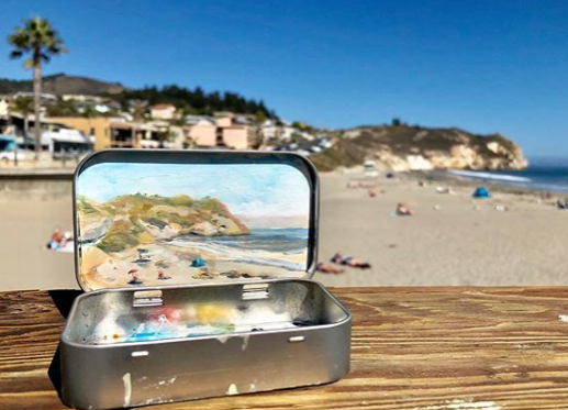
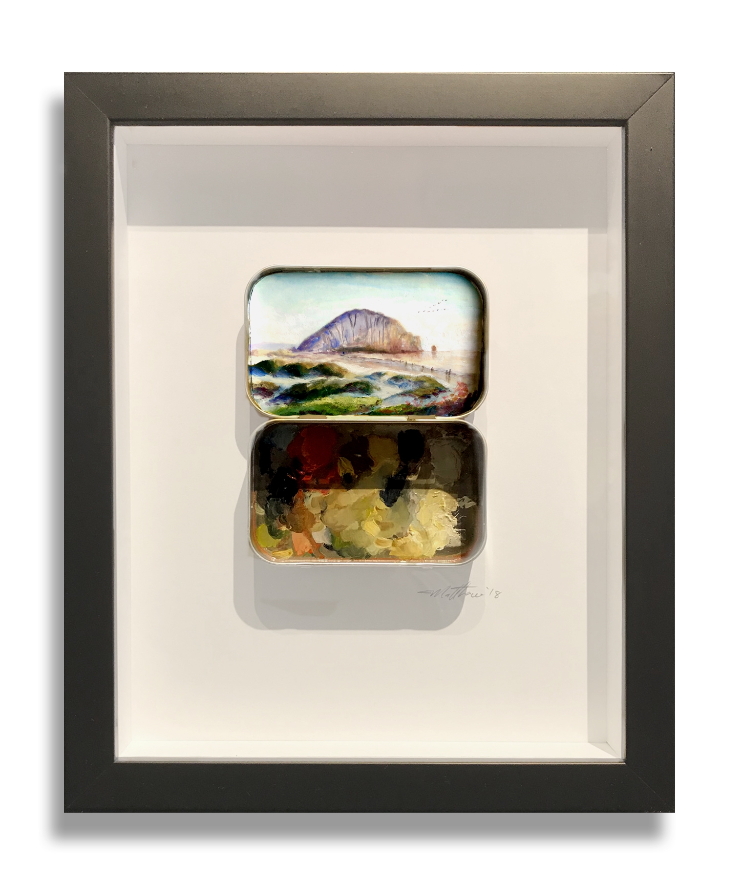
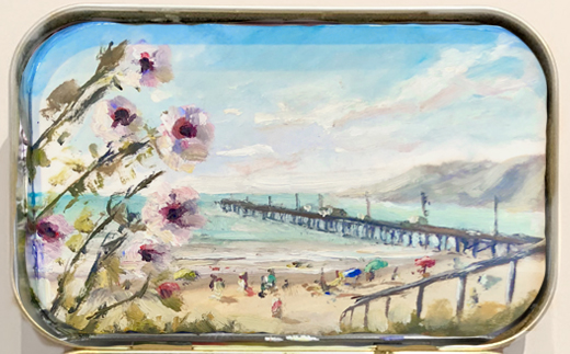
Matthew Betancourt’s clever take on Plein Air brings a fresh and fun element to our collection at Just Looking Gallery. His unique body of work consists of original Plein Air oil paintings ingeniously housed in Altoids Tins. All pieces are available museum mounted in a float frame.

California born and raised, Matthew Betancourt cannot remember a time when art wasn’t at his core. The self-taught artist recalls coming late to the dinner table for drawing the family cat on the stairs and being removed from high school English class for his elaborate desk doodles. Art remained his hobby until he won first place in Santa Maria City’s 2017 utility box contest just after receiving a BS in Biomedical Engineering in San Luis Obispo. Now, residing in Bergen, Norway with his wife, he is focused solely on developing his artwork classically, drawing inspiration from Rembrandt and Odd Nerdrum. While portraits and figures are his most personal works, his coined “MiniTins” are cherished little tokens of the places where he finds peace.

Matthew’s approach to painting not only speaks to the unique charm of the Central Coast and San Luis Obispo; it also serves as a constant reminder not to take ourselves too seriously and appreciate the beauty in the small things in life!

How Sotheby's Auction House just got Banksy-ed!

Banksy Painting 'Self-Destructs'

moments after being sold for $1.4 million at auction!

For an artist who's known for his stunts, this could be Banksy's most perfect art world prank. After the gavel fell Friday at Sotheby's auction house in London, Banksy's Girl with Balloon was reduced to shreds -- another apparent act in the disruptive career of the anonymous British graffiti artist.

The iconic image of a girl reaching out for a red, heart-shaped balloon, sold for $1.4 million. Moments later, a shredder hidden inside the "artist's frame" started its work and the art "self-destructed," according to a news release from Sotheby's

An image of Banksy's Girl with Red Balloon painting that self-destructed just moments after being sold in London. Credit: Sotheby's

An image of Banksy's Girl with Red Balloon painting that self-destructed just moments after being sold in London. Credit: Sotheby's

Banksy summed up the stunt with this quote on his Instagram account -- "Going, going, gone ..." along with a picture of stunned onlookers as the shredded art emerges from the bottom of the frame.

"It appears we just got Banksy-ed," Alex Branczik, Sotheby's senior director of contemporary art, said in the news release.

On Saturday, a video posted on Banksy's Instagram account showed the secret shredder being built into the frame "a few years ago ... in case it was ever put up for auction." The artist also posted the Picasso quote - "The urge to destroy is also a creative urge."

There's no word on how the shredder started operating at the key moment after the auction, though it could have been activated by a remote mechanism.

The auction price of $1.4 million for the spray paint and acrylic on canvas Girl with Balloon tied the artist's previous record set in 2008.

Image-1.png

JC Leyendecker Bronze Sculpture

"The Arrow Collar Man" Bronze Sculpture 

IMG 1.jpg

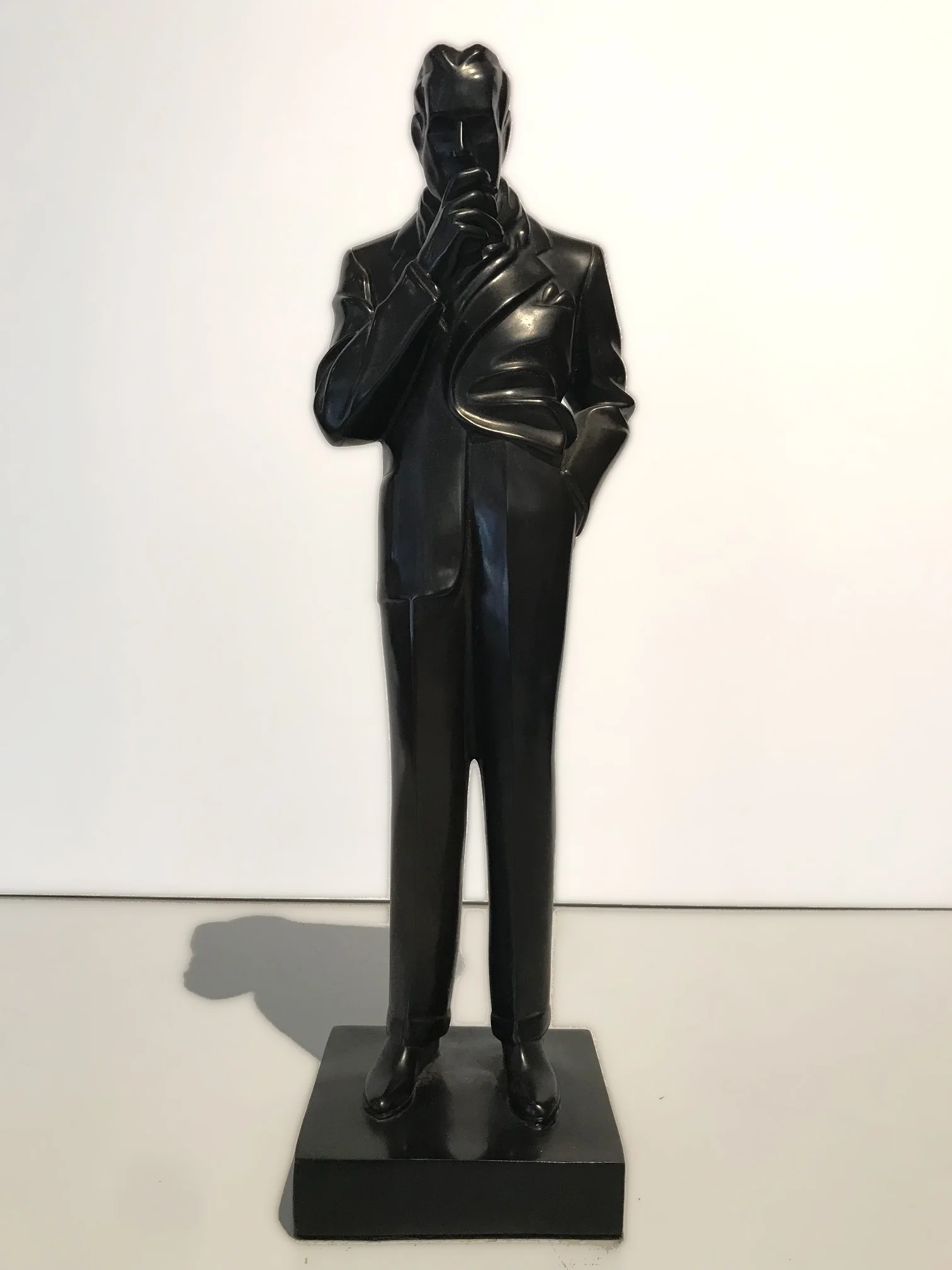
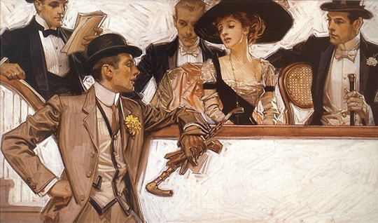
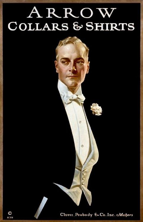
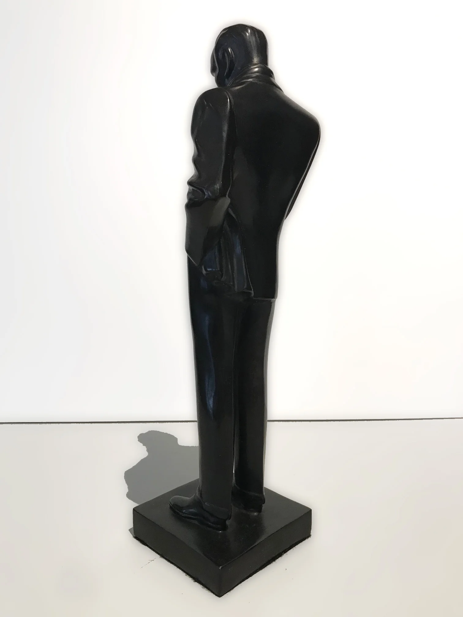
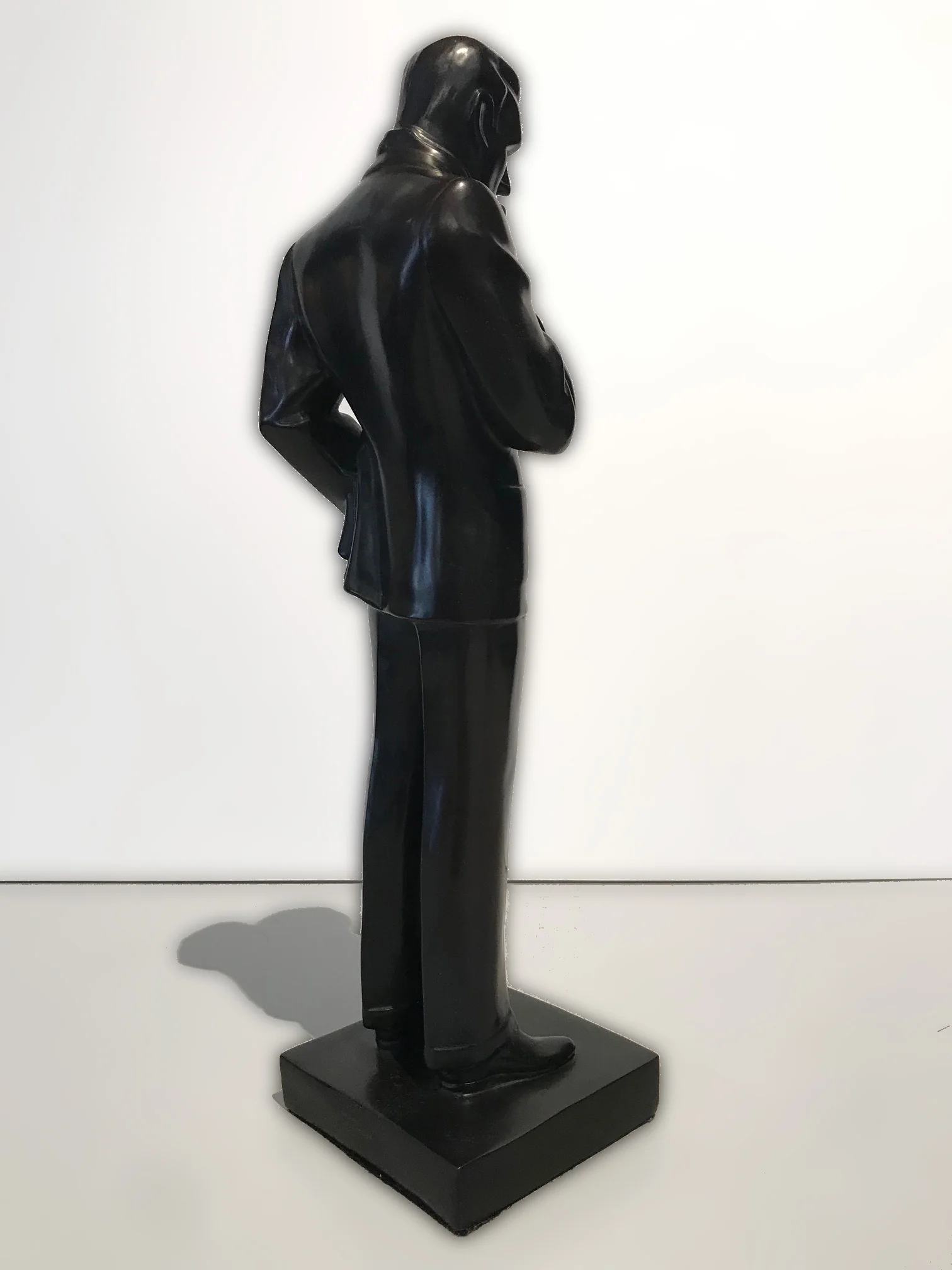
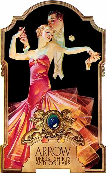
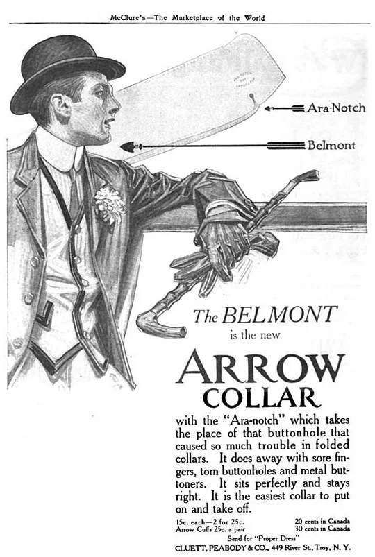
Often referred to as "The Smoker," this sculpture was actually an extremely rare bronze casting of a JC Leyendecker piece that was created for the New York menswear company Cluett Peabody & Company in the 1920's. Known as "The Arrow Collar Man," JC Leyendecker created an advertising campaign for Cluett Peabody & Company, which epitomized the ideal of male class and sophistication.

arrow_collar_09.jpg
leyendecker arrow 01.jpg
jcl_arrow1929.jpg
arrow_collar_07.jpg

With JC Leyendecker, the company created a series of countertop sculptures that were displayed in department stores as a means of promoting Cluett Peabody & Company's shirts and detachable shirt collars, known as the Arrow Collars.

Weighing in at 20 pounds, this solid bronze sculpture measures 17.5" tall, is in perfect condition and looks just as dapper as the day he was cast!

IMG 2.jpg
IMG 4.jpg
IMG 8.jpg
IMG 6 .jpg

Few American illustrators have had as much impact and success as JC Leyendecker (1874–1951). His paintings and illustrations for the mass publications of the early 20th century created sophisticated and highly successful American Illustrated Icons such as the “Arrow Collar Man” and the Saturday Evening Post’s “New Year’s Babies.” Leyendecker’s work and particular style went on to inspire many other highly popular illustrators of the era such as Norman Rockwell.
As a graduate from the Chicago Art Institute, and the Colarossi and Académie Julian in Paris; Leyendecker revolutionized the illustration and advertisement industries, both of which were seamlessly integrated into his masterpieces.

Learn more about JC Leyendecker

IMG 9.jpg
IMG 10.jpg
IMG 11.jpg

Behind the Scenes of Canvas Stretching

The process of stretching a canvas is an enigma to most people. Sure there are some wooden bars and a few staples involved, but what really goes on behind the stretching of a canvas? Although this process is not rocket science, there are a few key steps that help ensure a piece of artwork will be correctly lined up and hold enough tension to display the imagery accurately. Here at the gallery we stretch dozens of pieces every week!

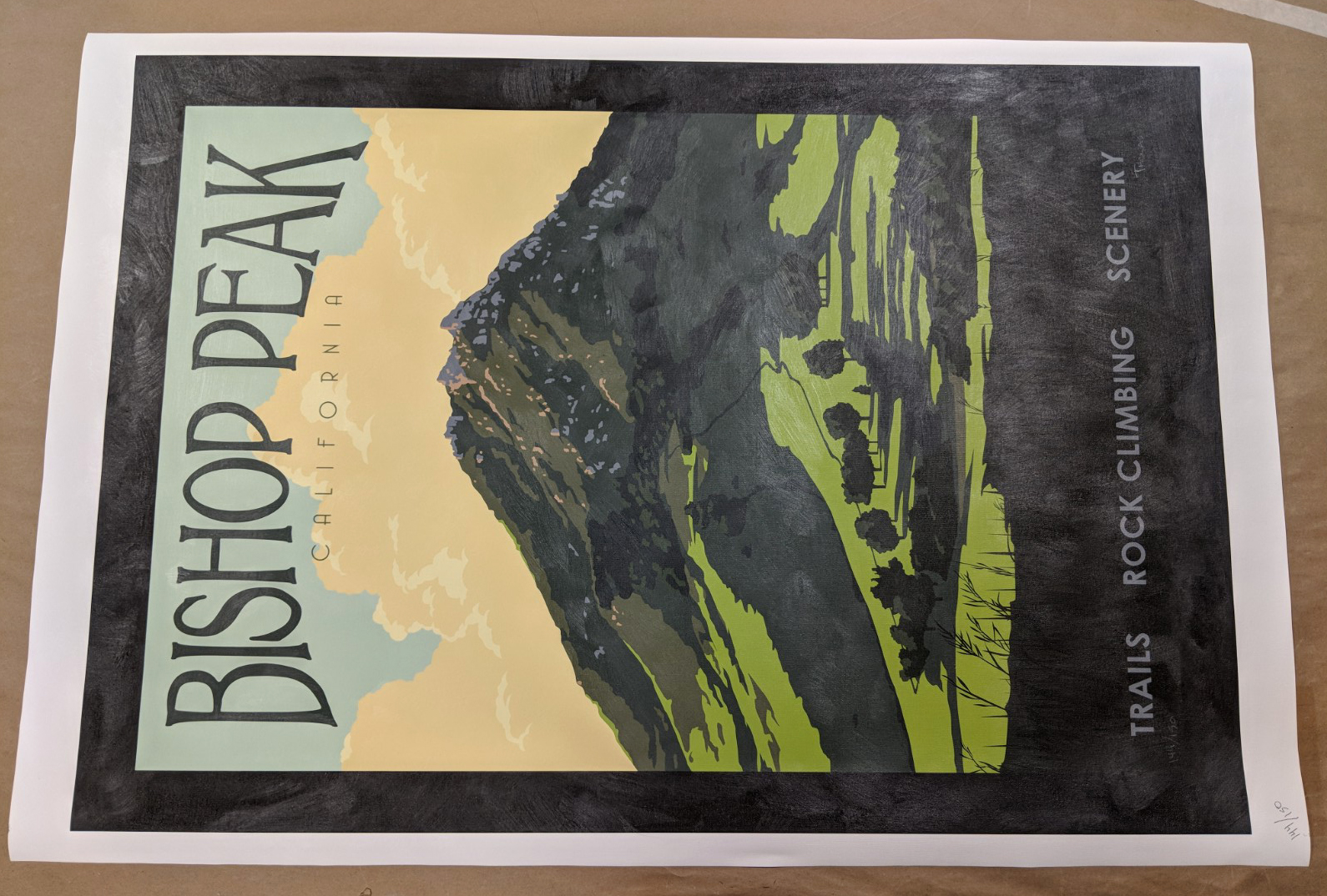
Our process begins with the linen canvas to be stretched

Bishop Peak Limited Edition Print on Canvas

Bishop Peak Limited Edition Print on Canvas

Wooden stretcher bars

Wooden stretcher bars

1) The image area of the canvas is measured to ensure you have the right size stretcher bars.

2) Assemble to stretcher bars so that it creates the frame structure that you'll stretch your canvas on.

3) Measure from the edge of the image to the edge of the canvas, do this on all four sides of the piece, these measurements will help you correctly line up the stretcher bars on the back.

measuring the face of the canvas.

measuring the face of the canvas.

cuts made to reduce the fabric to be folded in each corner.

cuts made to reduce the fabric to be folded in each corner.

4) Working with this pattern also helps determine how much canvas will be cut in the corners in order to avoid bulging of the canvas where it gets tucked and folded on the corners when stretching.

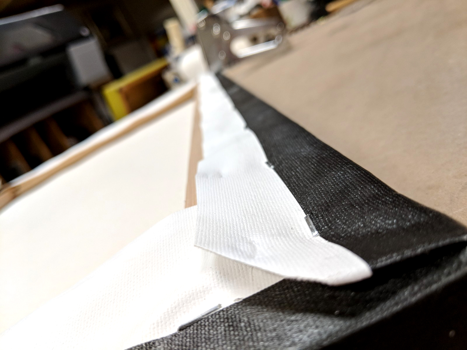
5) Once everything is lined up the stapling begins. During this part of the process it is imperative to ensure the canvas is tensioned enough, so pull tightly! Constantly alternating which side is being stapled also helps you evenly distribute the tension along the face of the artwork.

6) Folding the corners of the canvas is like wrapping a special birthday present, you've already cut the bulk of the extra canvas out of the corner by using that pattern above. The top and bottom sections of the canvas should be folded first, then the sides are folded in and the extra fabric is simply tucked into the sides before the final few staples go in. 

staples.jpg
keys.jpg
other keys.jpg

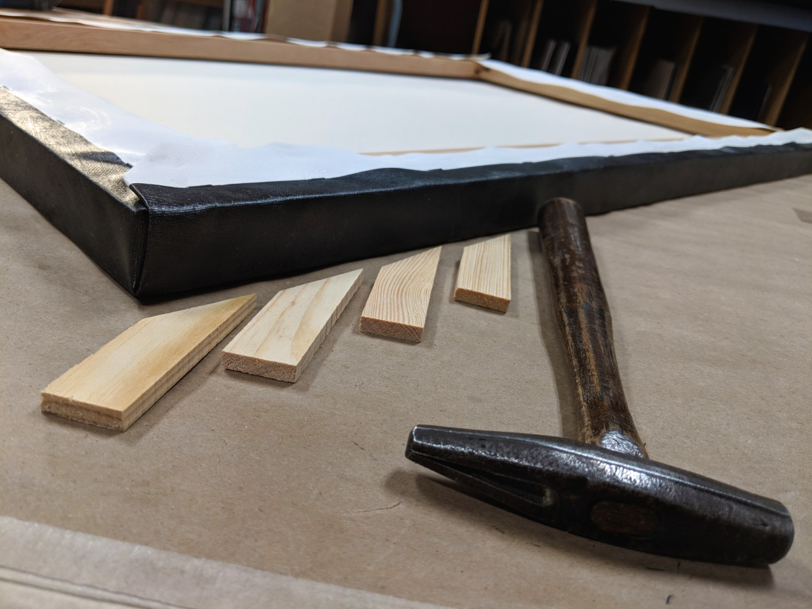
7) Once the stapling is done, corner keys are hammered into each corner. Once again, this helps ensure the canvas has enough tension, and it also allows for more tension to be easily introduced in the future without re-stretching the canvas. A small dab of wood glue on the corner keys will help keep them locked into place, keeping your canvas tight and looking good for many years. 

8) As the final step at our gallery we like to back each canvas with black board in order to protect the back from dust. This also allows us to mount paperwork, certificates of authenticity, and even sometimes a dedication note from the artist which can give the artwork a more personal touch!

back.jpg
hang.jpg
we use 1/4" staples for the linen and 3/5" for the backing.

we use 1/4" staples for the linen and 3/5" for the backing.

Stretched canvas.

Stretched canvas.

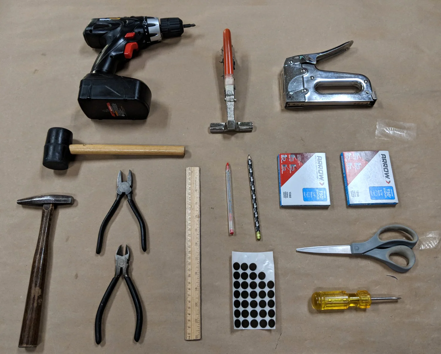
A special thanks to all the tools that make stretching canvas at our gallery possible!

A special thanks to all the tools that make stretching canvas at our gallery possible!

Golden Gate Bridge - A Symphony In Steel

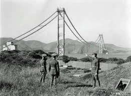
the-golden-gate-bridge-just-turned-80-years-old-take-a-look-at-its-historic-build.png

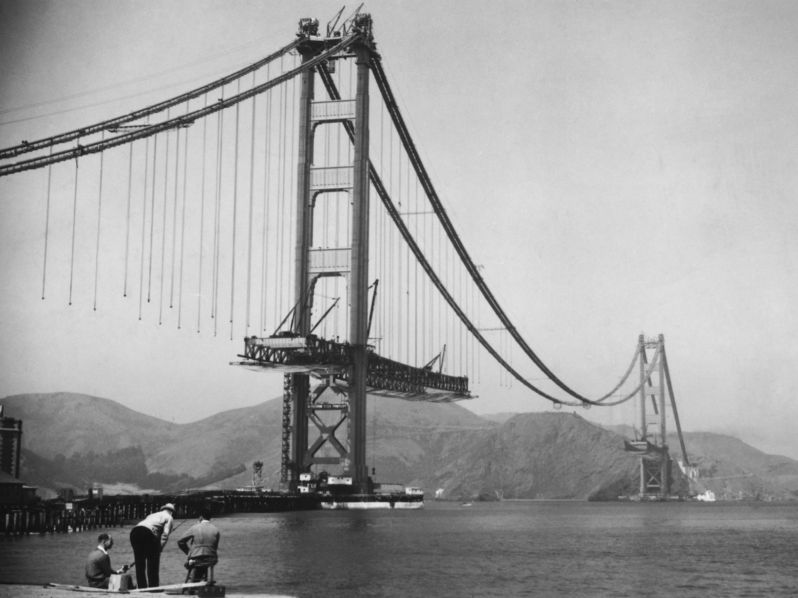
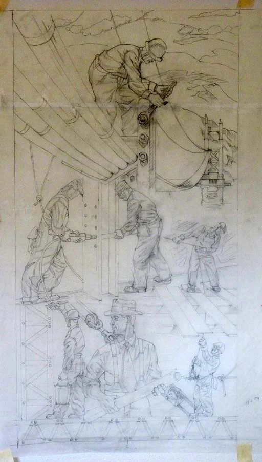
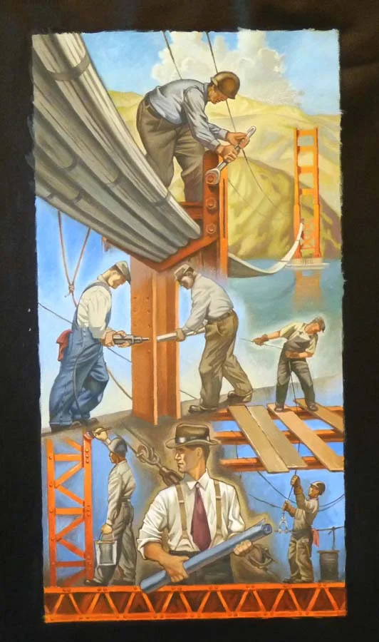
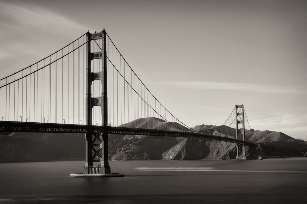
To this day the Golden Gate Bridge stands its ground as one of the most iconic landmarks of California. With as much history behind its construction as steel in its foundation, we decided a tribute piece was an absolute necessity at the Gallery. Much like the planning and construction of the bridge, the painting of this breathtaking piece went through several development phases. Artist, Tim Huhn began this process with a pencil drawing to study and perfect the composition of the piece. Much like the original blueprints of a construction project, these initial drawings paved the road to what later would become a study painting exploring color schemes, and finally, the finished piece in all of its glory and beauty. 

Early pencil drawing on tissue paper focusing on the line-work and composition of the piece.

Early pencil drawing on tissue paper focusing on the line-work and composition of the piece.

Study painting in progress 

Study painting in progress 

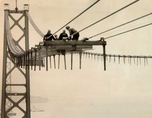
The construction of this 1.7 mile long Wonder of the Modern World was entrusted to Chicago-based engineer Joseph Strauss, who promised the grand project could be completed for $30 million. In it's early days the proposal for the construction faced many obstacles and much opposition from some communities around the area, Southern Pacific Railroad, and even The Department of War, and Navy. However, the project managed to overcome these barriers when in May of 1923 the State Legislature passed the Golden Gate Bridge and Highway District Act of California. On April 19th, 1937 the roadway was finally complete. The bridge opened to pedestrians on May 27th, and to vehicles one day later on the 28th.


Finished Study Painting

Finished Study Painting

Upon the completion of the project, Strauss (also a poet) composed a poem titled
"A Mighty Task Is Done."

http---a.amz.mshcdn.com-wp-content-uploads-2015-05-Gate-6.jpg
AP070131011754.jpg
"A Mighty Task Is Done"

At last the mighty task is done;
Resplendent in the western sun
The Bridge looms mountain high;
Its titan piers grip ocean floor,
Its great steel arms link shore with shore,
Its towers pierce the sky.
men_working_on_catwalk.jpg

On its broad decks in rightful pride,
The world in swift parade shall ride,
Throughout all time to be;
Beneath, fleet ships from every port,
Vast landlocked bay, historic fort,
And dwarfing all--the sea.
images.jpg
To north, the Redwood Empire's gates;
'To south, a happy playground waits,
in Rapturous appeal;
Here nature, free since time began,
Yields to the restless moods of man,
Accepts his bonds of steel.
s_g09_70527056.jpg
Launched midst a thousand hopes and fears,
Damned by a thousand hostile sneers,
Yet ne'er its course was stayed,
But ask of those who met the foe
Who stood alone when faith was low,
Ask them the price they paid.
golden_gate_bridge_02.jpg
Ask of the steel, each strut and wire,
Ask of the searching, purging fire,
That marked their natal hour;
Ask of the mind, the hand, the heart,
Ask of each single, stalwart part,
What gave it force and power.
An Honored cause and nobly fought
And that which they so bravely wrought,
Now glorifies their deed,
No selfish urge shall stain its life,
Nor envy, greed, intrigue, nor strife,
Nor false, ignoble creed.
High overhead its lights shall gleam,
Far, far below life's restless stream,
Unceasingly shall flow;
For this was spun its lithe fine form,
To fear not war, nor time, nor storm,
For Fate had meant it so.

Today 81 years later, Tim Huhn Dedicates his own tribute painting to this majestic and timeless accomplishment of mankind titled "A Symphony In Steel." 

Wonder Bread - You Are Wonderful

Wonder Bread truly revolutionized America's shelves and kitchens when it was first introduced to the market on the 21st of May, 1921. Ever heard of the expression "The Best Thing Since Sliced Bread"? Well, Wonder Bread was the FIRST pre-sliced loaf sold in the 1930s. Its undoubtedly iconic and timeless logo was partly inspired by the International Ballon Race at the Indianapolis Speedway; and to this day, it remains engraved in the minds of millions of bread loving Americans. 

wonder bread billboard.jpg

Aaron Eskridge's witty and clever humor shines through his latest piece "You Are Wonderful."  Here, Eskridge makes use of the nostalgic Wonder Bread colors, while also introducing a refreshing new perspective from his own artistic vision. Featuring a genuinely warm and optimistic message, "You are Wonderful" also serves as a pleasant reminder that, even at our lowest points we must always remember the wonders that exist in each one of us. 

You Are Wonderful by Aaron Eskridge - Limited Edition Print on Canvas 18" x 72" $900
You Are Wonderful by Aaron Eskridge - Original on Board 24" x 96" $4,000

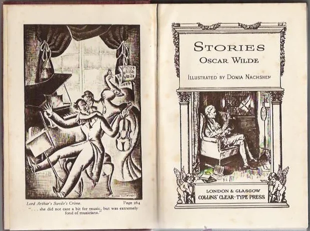
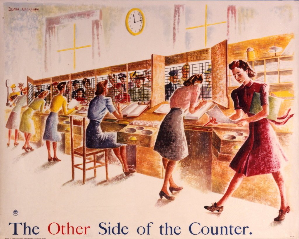
So, who is Donia Nachshen?

Born in the city of Zhitomir (current day Ukraine) and later settled into London; Donia Nashchen quickly established herself as a successful book illustrator after graduating from the Slade School of Art. Her early career, which mostly consisted of book illustrations, includes the works of world renowned authors such as Arthur Schnitzler, Anatole France, and Oscar Wilde

d995504cc88dd5605ea458c0ad169e4d.jpg
Telegraph Less, 1943.

Telegraph Less, 1943.

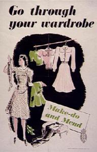
Once World War II hit Europe, Nashchen gravitated towards illustrating posters for a number of campaigns, including the "Make Do and Mend" Campaign, ran by the British Board of Trade. Nachshen's talent and passion for her craft become apparent by the continuation of her book illustration career, even with WWII right at her doorstep. 


make-do-and-mend.jpg


At Just Looking Gallery we ran into an interesting connection to Donia Nachshen when two of our clients turned out to be related to her. Nachshen's Art Deco style very closely resembles the style of various artists at our gallery, including Steve Thomas' Travel pieces and Tim Huhn's WPA paintings. 

prd0312_1024x1024.jpg

Who is Eichler and why "I Like Eich!"

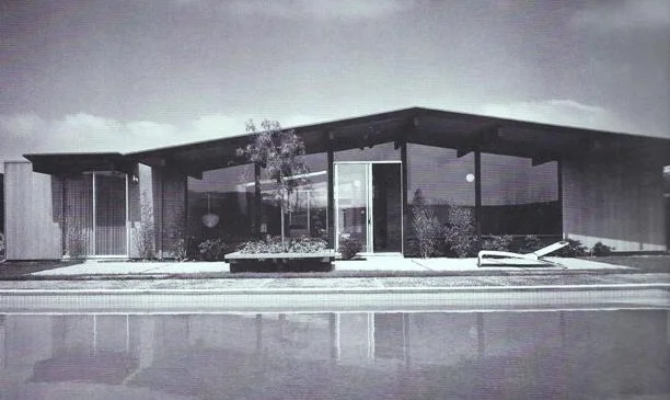
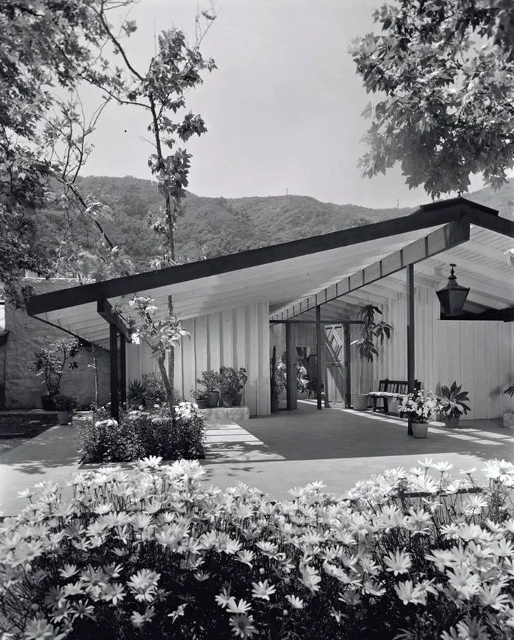
Eichler houses, found throughout Northern and Southern California (and even outside of New York City), are some of the most celebrated tract residences in the United States. Built by a company founded by Bronx-born Joseph L. Eichler (1900-1974), the homes were constructed between 1949 and 1966 and brought midcentury-modern design to the masses through tract houses constructed in postwar residential subdivisions.

mid-C-eichler.jpg
livingroom.jpg
b9798f4024cdbc2151cc348892e19731--vintage-houses-cliff-may-homes.jpg

The style came to be known as "California modern:" a local, nature-inspired take on the architectural principals of modernists like Mies van der Rohe and Frank Lloyd Wright. With flat or low-slung gabled roofs, an emphasis on low, horizontal forms, and few (if any) windows, Eichler facades were initially seen as unconventional, but the light-filled interiors with skylights, floor-to-ceiling windows, and private outdoor rooms and gardens quickly caught on in California. 

Article resourced from Dwell

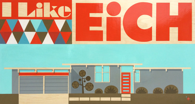
"I Like Eich" - 36"x60" - Original Acrylic on Board by Aaron Eskridge

"I Like Eich" - 36"x60" - Original Acrylic on Board by Aaron Eskridge

Artist and Illustrator, Aaron Eskridge, also shares California's enthusiasm about Eichler's work.
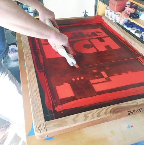
As a clever play on the 1952 Presidential Campaign "I Like Ike" for Dwight D. Eisenhower, Aaron Eskridge has created a series of "I Like Eich" paintings and hand pulled serigraph prints.  Eskridge's series showcases his appreciation for Eichler's design style, and the impact it had in the modern architecture industry throughout the United States.

"I Like Eich" - 36"x60" - Original Acrylic on Board by Aaron Eskridge

"I Like Eich" - 36"x60" - Original Acrylic on Board by Aaron Eskridge

"I Like Eich" - 18"x24.5" - Limited Edition Serigraph by Aaron Eskridge

"I Like Eich" - 18"x24.5" - Limited Edition Serigraph by Aaron Eskridge

"I Like Eich" - 36"x60" - Original Acrylic on Board by Aaron Eskridge

"I Like Eich" - 36"x60" - Original Acrylic on Board by Aaron Eskridge

"I Like Eich" - 18"x24.5" - Limited Edition Serigraph by Aaron Eskridge

"I Like Eich" - 18"x24.5" - Limited Edition Serigraph by Aaron Eskridge

Introducing Jeremy Harper

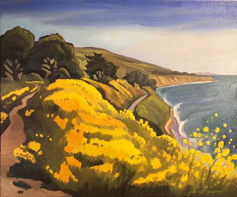
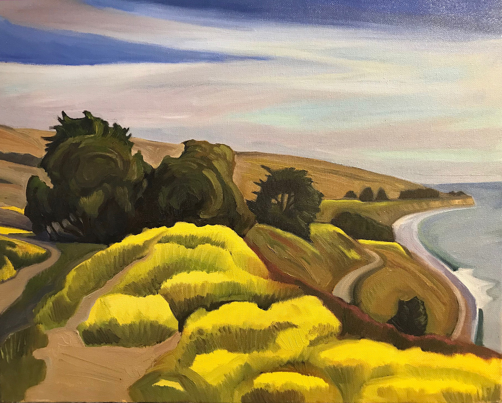
We were recently introduced to the gorgeous plein air art of Jeremy Harper and we immediately fell in love with his brush work, colors and of course Central Coast subject matter. Harper was raised in the beautiful Santa Barbara where he developed his artistic ability attending local art schools.  As his talent grew he went on to attend the San Francisco Art Institute and graduated with a degree in the fine arts.

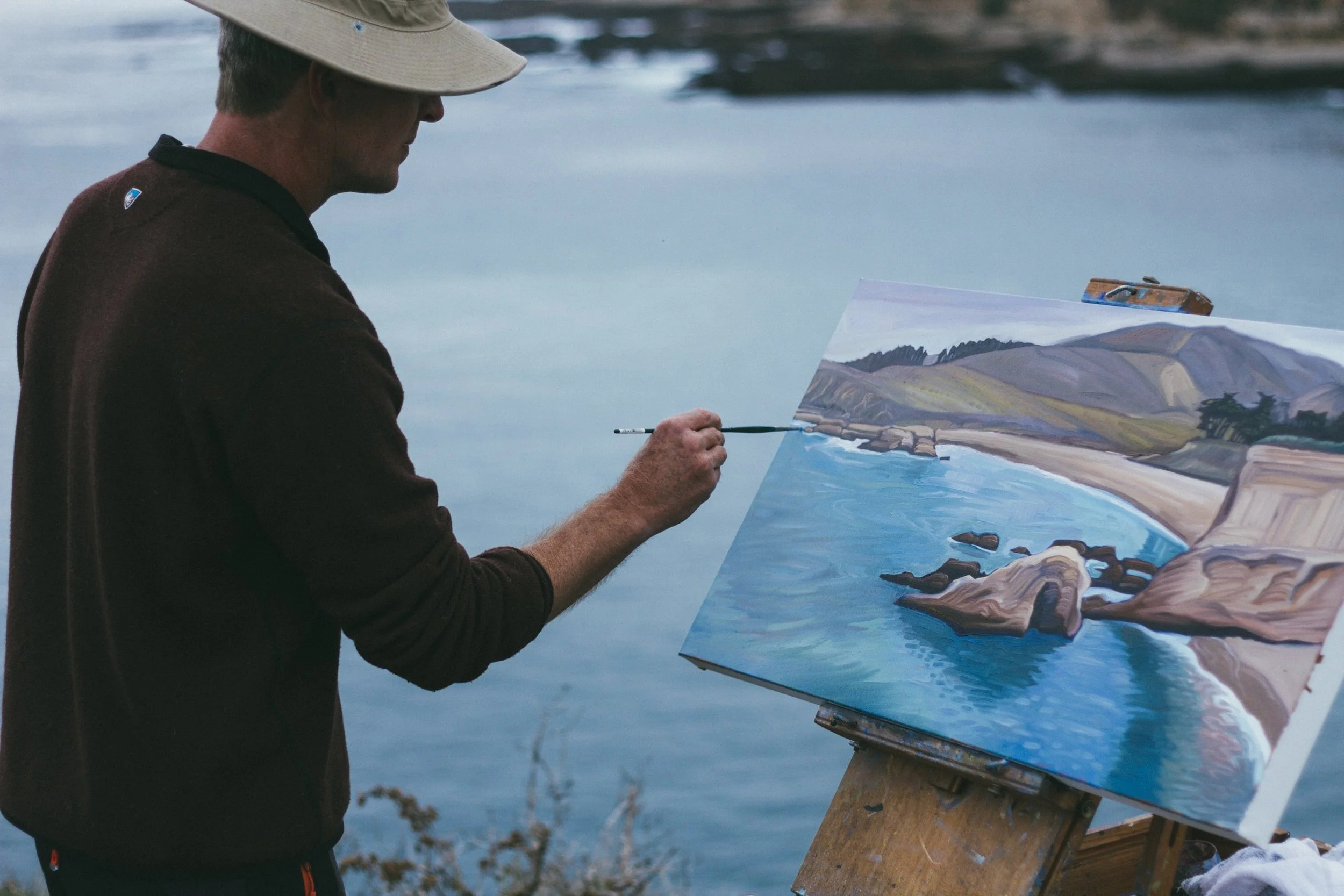
Harper's impressionistic oil paintings are incredibly unique and capture the majestic atmosphere of the landscapes they represent.  He surrounds himself with the subject, painting each piece outdoors in the midst of the landscape, a practice referred to as "plein air painting."  Unlike referencing a photograph or a still image of their subject in the studio, plein air artists are influenced by the constant movement and natural change of the environment.

Artists have long painted outdoors, but in the mid-19th century, working in natural light became particularly important to the Barbizon schoolHudson River School, and Impressionists. The popularity of painting en plein air increased in the 1840s with the introduction of paints in tubes, where previously, painters made their own paints by grinding and mixing dry pigment powders with linseed oil. The act of outdoor painting from observation has been continually popular well into the 21st century with artists like Jeremy Harper.

With each piece Harper continues this long practiced and skillful tradition of plein air painting and creates a stunning visualization that captures the beauty of our iconic California coastline.

Steve Thomas Continues the Tradition of Great Railway Travel Posters

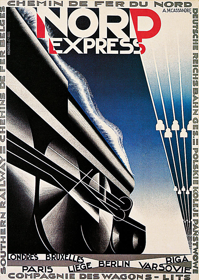
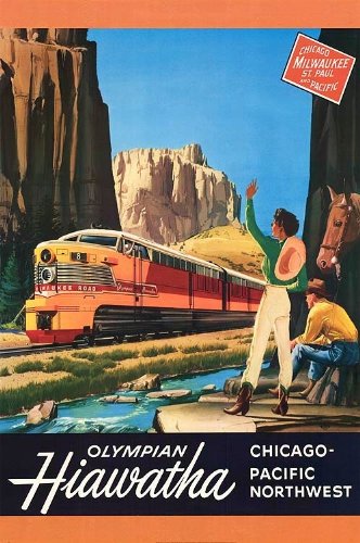
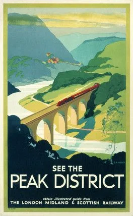
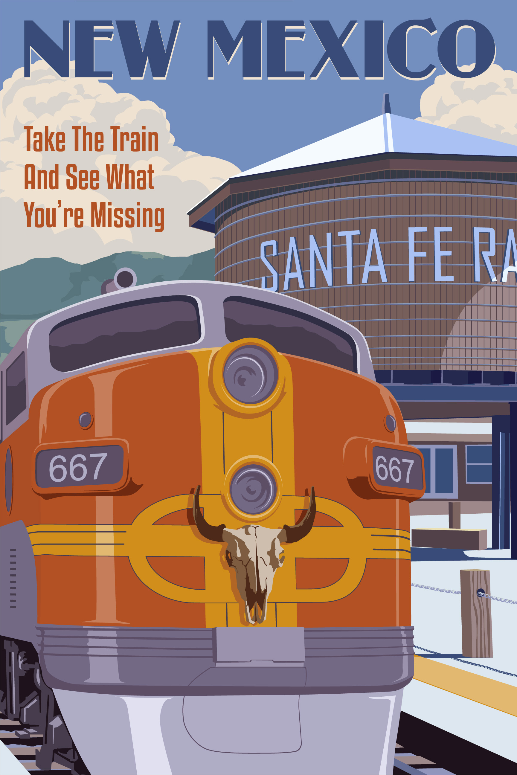
Steve Thomas' newest piece carries forward the tradition of great Art Deco Railway Travel Posters.

The 1930's was the Golden Age for Art Deco; and while shadowed by the Great Depression, it was a period filled with imagination and driven by dreamers.  Artists played an important social role as they developed imagery that depicted hope and opportunity; and one of their favorite medias to project their artistic vision was poster art.  From lavish cruise ship travel to the soaring air posters of the 30's travel posters told a story of places most had only dreamed of seeing; but some of the best Art Deco Travel Posters were those of the Railways.

nord-express-a-m-cassandre.jpg
train-poster-01_1.jpg
51NOcyMhQWL.jpg

Collectors Weekly has a wonderful write-up on the history and importance of the Railway Travel Posters.  "Almost immediately after the final spike was driven into the 1,912-mile First Transcontinental Railroad at Promontory Summit, Utah, on May 10, 1869, marketers began producing posters and other advertising materials designed to lure farmers and entrepreneurs living east of the Mississippi River to the Wild West. This sort of marketing effort was hardly unique to the United States. On November 7, 1885, when Canadians celebrated the completion of their nation’s even longer transcontinental railroad at Craigellachie, British Columbia, luring settlers west via advertising was deemed an essential part of nation-building. Indeed, executives of the Canadian Pacific Railway relied so heavily on graphic design, by the 1930s they had made room for a dedicated silkscreen studio within Montreal’s railway station, where posters and other materials were cranked out by the thousands. Similarly, half a world away in New Zealand, that nation’s Railways Department set up its own Railways Studios in 1915, defining the look of outdoor advertising in the country for more than half a century. But unlike in the United States and Canada, where the initial task was to encourage settlement, the goals for the posters that came out of Railway Studios were always about getting New Zealanders to explore their multi-island nation by rail. That last part was especially important because between World War I and World War II, New Zealand had become one of the most car-crazy countries in the world. But the artists hired by Railways Studios did such a good job of encouraging the public to take their weekend getaways by train that attendance at churches actually suffered. Stylistically, railroad posters have varied by region. The posters produced by London’s Underground during the 1920s and ’30s used Art Deco to lure residents and tourists alike to flowers in Kew Gardens, theaters in the West End, and the city’s famous zoo. During the same period, Art Deco was given an air of mystery in the railway posters produced in Japan, in which travelers were enticed to visit Japan’s numerous natural parks, where waterfalls and hot springs awaited. And while depictions of trains may have been absent in those posters, sales copy with detailed descriptions of discounts were not. Again, these posters were beautiful, but they always had to earn their keep as sales tools."  Referenced from Collectors Weekly.

51CAukmL3wL.jpg
aaaa9ff32c1aa33de8eed1619c332cd7.jpg
TRN82_The_Coronation_Scot_1937.jpg

As Steve Thomas has cemented himself as the 21st Century's Titan of the Art Deco Travel Poster, it was only natural that he would develop a series of 1930's style Art Deco Railway Travel Posters, and where better to start than San Luis Obispo.  Depicting the idyllic setting of San Luis Obispo, the Pacific Surfliner winds its way through the hills with Bishop Peak standing tall in the background.  This piece plays to our nostalgic feeling of the Central Coast, but simultaneously captures our sense of adventure and begs us to take the train and see what we've been missing!

The Inspiration of Tim Huhn's "Five Dollar Day"

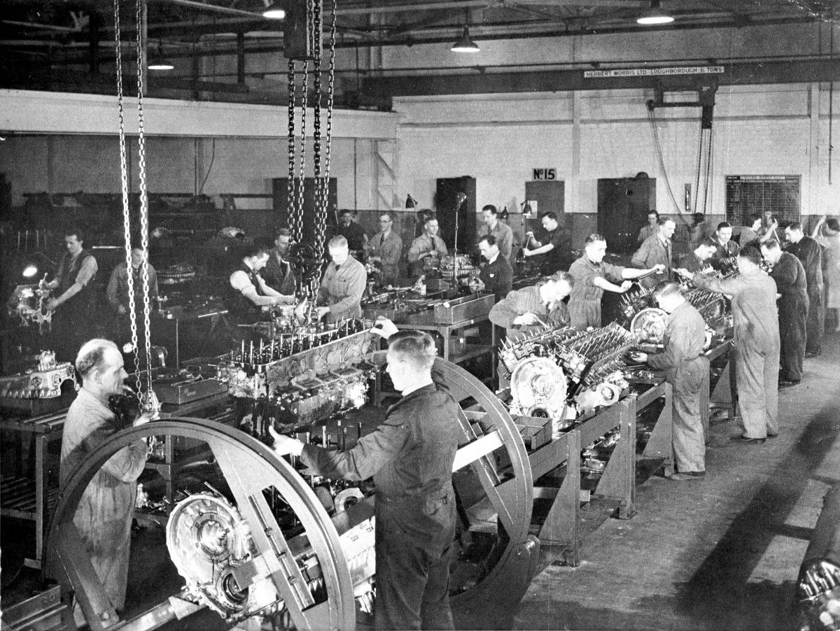
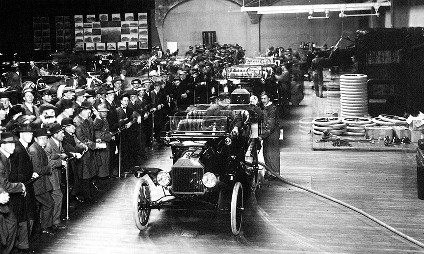
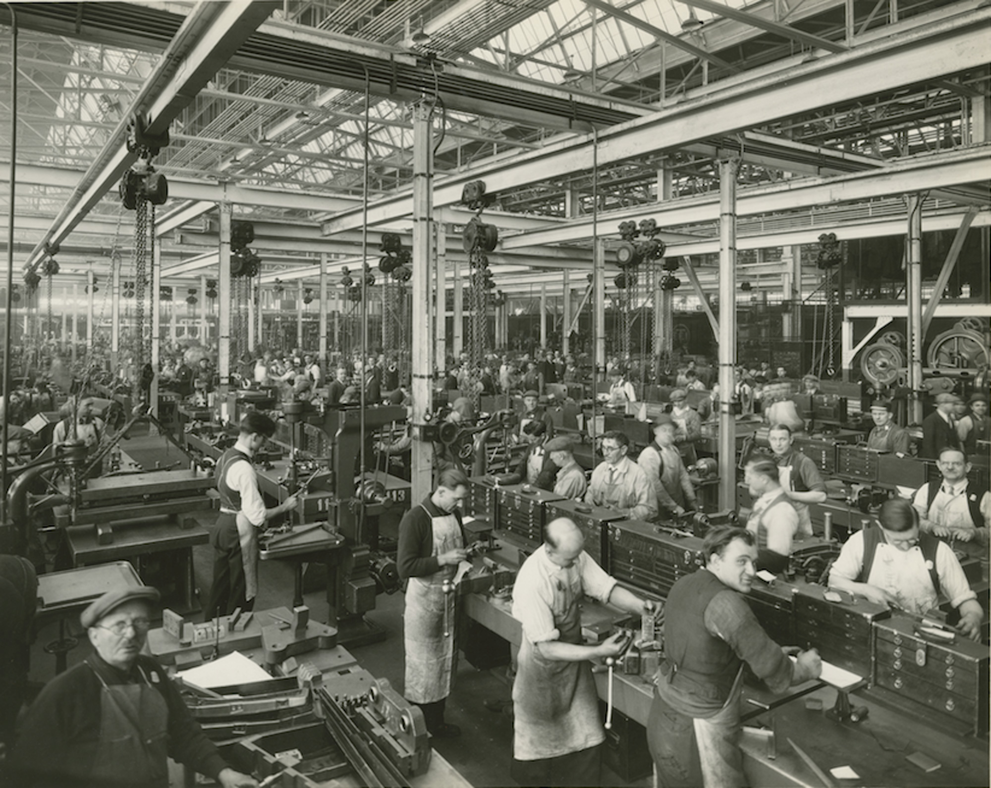
In an era of industrial revolution Henry Ford made a name for himself by introducing the assembly line and rethinking the culture of a business.  The "Five Dollar Day" was a pioneering idea that focused on the livelihood of Ford's employees.  It was a first step in realizing the value that motivated individuals bring to a business and the importance of developing a proud company culture.  

In 1913 Ford needed a workforce of 14,000 people, but with the harsh conditions of factory work and minimal wage earnings, Ford found employee retention difficult as he went through 52,000 people in just one year.  In order to keep production on pace with the high demand of the Model T, Ford needed to make a change.

Ford developed a plan that kept wages at the same $2.30 per day but offered a daily bonus of $2.70 to all employees who worked hard and maintained a healthy lifestyle outside of the workplace.  The new Five Dollar Day dominated headlines all over the country.  It's purpose was to improve employee satisfaction and maintain a functioning, motivated workforce.  It represented a major shift in the way managers approached running a business.  Rather than viewing workers simply as a business expense Ford realized that the success of his company depended on the success of every individual employee.  Ford's revolutionary ideas changed the world.

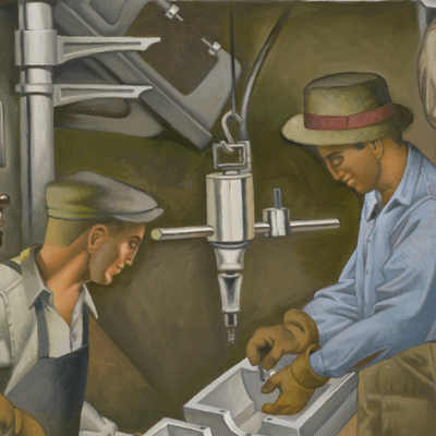
As Tim Huhn's Art Deco stylized murals are centered around the themes of hard work and achievement, Tim wanted to pay tribute to Ford, an American Titan that changed the landscape of industry forever.  Tim's incredibly detailed and striking painting exemplifies the spirit of Ford's "The Five Dollar Day" and the optimism of American Muscle.  For those of us that are drawn to Tim Huhn's art deco series, there's a freedom to this piece that speaks to the sense of hard-work and achievement, the idea of knowing what you're working for and not compromising.  For those of us that see that there's always room for change and improvement in the world, we're inspired by Tim's art because in the face of great change there is most certainly a fear of failure, but we must intimidate fear with a strong and unrelenting work-ethic.  This piece stands for something, it stands for the morality by which we work!

The Five Dollar Day.jpg

Tea Late Afternoon

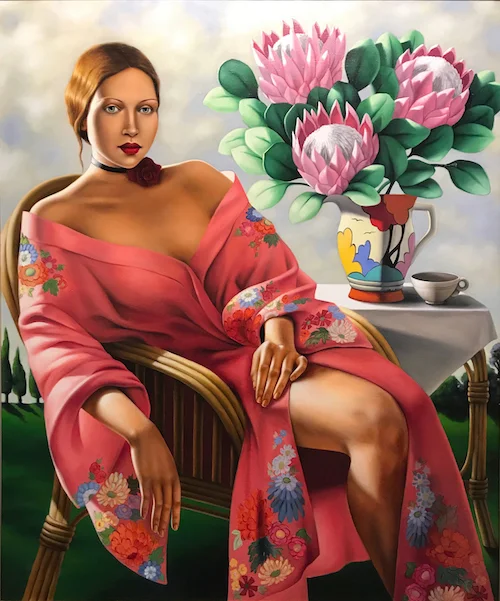
Catherine Abel Tea Late Afternoon 40x48 original (small).jpg

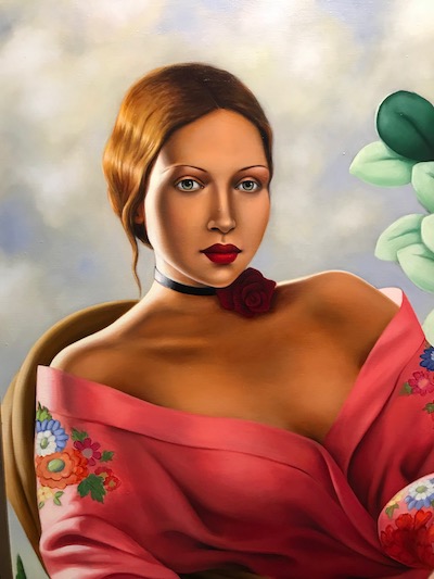
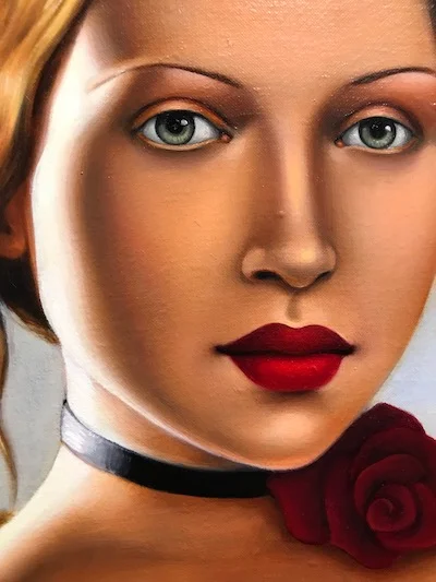
Painted in 2005 and exhibited in Sydney Australia, this original oil painting on canvas by Catherine Abel has spent the past 12 years in a private collection here in California.  Titled "Tea Late Afternoon" this original oil painting on canvas measures 40"x48".  The painting is centered around the climate and culture of Summer in Sydney.  In her signature style, Catherine wanted to capture the strong golden light of Australia paired with Australia's cultural dichotomy.  

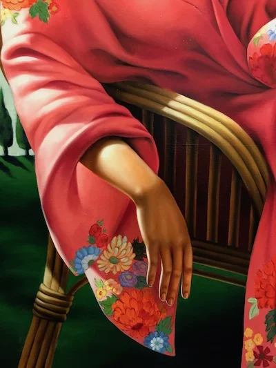
The model was a close friend and neighbor of Catherine Abel's at the time.  The cane/wicker chair she's sitting on is very Australian in style, the painting is complimented by Australian floral displays of the Protea flowers (that were in bloom at the time) and the small Jacaranda tree (purple flowers bottom right) a signature display of Sydney, this piece is the epitome of Tea on a Late Afternoon in Australia.  

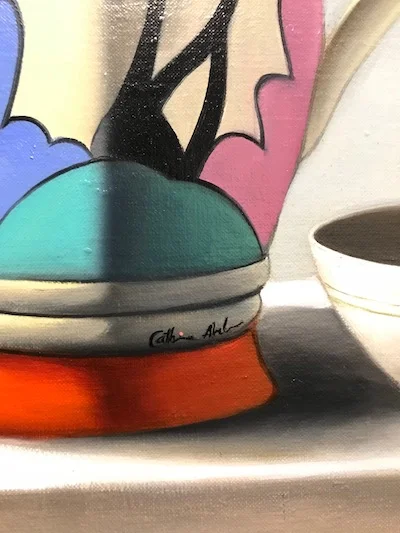
Beyond the tradition of afternoon tea, there is a hint of Australia's British past too, hence the traditional tea cup and the Clarice Cliff pottery, an English Ceramic Artist active from 1922 to 1963.

Our Top 5 Holiday Wish List

Logo w: Wreath.jpg

When you're looking for the perfect Holiday Gift, look no further than the Central Coast of California; San Luis Obispo offers up plenty that'll top anybody's list.  Whether they're Music Lovers, Cal Poly Fanatics, Wine Enthusiasts, Beer Lovers, or Admirers of Madonna Inn and Hearst Castle; we've got Our Top 5 Holiday Wish List here for you!

Our Top 5 Picks for Music Lovers

#1 Classic Vintage Records from Boo Boo Records in Downtown San Luis Obispo.  Established in 1974, Boo Boo Records has become an icon of Downtown SLO as it's been named one of the top vinyl stores in America by Rolling Stone Magazine.  In addition to their vast vinyl racks, Boo Boo’s continues to offer unique, iconic ‘lifestyle’ gifts while continuing to expand on the best selection of new and used Vinyl, CD’s and DVD’s, Shirts and other Collectibles. Vinyl, in particular, has continued to enjoy a renaissance and has surprised pundits by bringing in many new young music fans eager to experience this revered format on its rightful march toward renewed relevance.  Surprise your loved ones with a copy of Pink Floyd's album Off the Wall or Duran Duran's album Rio, it'll bring some life to your holiday party.

#2 Fine Art Prints of Boo Boo Records by famous artist Steve Thomas.  In June of 2016, Steve Thomas released his first print of Boo Boo Records and we quickly learned what a big deal this small-town record shop was.  We had people rushing in to pick-up their print of Boo Boo's and they would tell us stories of first dates vinyl shopping, weekly visits to their store and how this piece perfectly captured the vinyl culture.  Since that first piece we've realized that Boo Boo Records isn't just a great local record shop, but that they're one of the best vinyl stores in the US!  We love the friendly vibe and the passion that they continue to share with each generation that discovers the beauty of vinyl.  As Steve began to work on the new Boo Boo Records piece this past August he was able to collaborate with Mike White, owner of Boo Boo Records, to line out a new visual concept that captured the nostalgic feeling and eclectic quality of vinyl collecting; and of course Steve had to sneak a few favorite albums in there too!  Can you spot the hidden treasures?

#3 Tickets to Jethro Tull Live at Vina Robles Amphitheatre on June 3rd, 2018.  It was on the 2nd of February 1968 at the world-famous Marquee Club in Wardour Street that Jethro Tull first performed under that name. The group would go on to become one of the most successful and enduring bands of their era, selling over 60 million albums worldwide and entering the cultural collective consciousness along the way.  To celebrate this golden anniversary, Ian Anderson will present 50 years of Jethro Tull at the Vina Robles Amphitheatre on Sunday, June 3.  Ian Anderson is accompanied by Tull band musicians David Goodier (bass), John O'Hara (keyboards), Florian Opahle (guitar), Scott Hammond (drums) and surprise virtual guests.

#4 Vinyl Me Please Monthly Subscription.  Vinyl Me, Please is a record of the month club. The best damn record, in fact.  Their mission is to help people explore, experience and enjoy music on a deeper level.  Join the thousands of people wordwide by becoming a member.

#5 Sonos Speaker System.  Sonos is a home sound system that works as a smart network of wireless speakers to fill your home with pure, immersive sound, room by room.  If you're looking for a local representative to work with you and ensure that you get the right combination of Sonos products for your home or business check out Audio Vision in San Luis Obispo.

Our Top 5 Picks for Cal Poly Fanatics

#1 Classic Cal Poly Hoodie from the Downtown Cal Poly Store is the timeless gift that's sure to be worn every lazy weekend.  Help your loved ones show their Poly Pride with this classic and comforting gift.

#2 Fine Art Print of Cal Poly by famous artist Steve Thomas.

#3 Cal Poly Chocolates, started in 2000 as a student enterprise project, is a part of Cal Poly's Food Science and  Nutrition Department.  Student employees, under the  guidance of Operations Manager Molly Lear, learn how to  develop, create, package and market various chocolate products using strictly organic and Fair Trade certified chocolate.  Chocolates are sold in Central Coast markets, on campus at Campus Market, and by special order.

#4 Tickets to a Cal Poly Baseball Game.  Cal Poly's Baseball team is very competitive and always draws a big home crowd.  Pick some of your favorite rivalries, put on that classic Cal Poly hat, shirt or hoodie, buy tickets for your family and friends, and enjoy the game!

#5 Tickets to see the Cal Poly Band perform at the PAC.  With CD recordings and international tours, the Cal Poly Wind Ensemble and Wind Orchestra (concert bands) have established a wide reputation for musical excellence. Both groups perform each quarter in the San Luis Obispo Performing Arts Center.

Our Tip 5 Picks for Wine Enthusiasts

#1 Wine Tasting Tour with 101 Wine Tours.  Experience Wine Country in luxury and safety, with panoramic views from a Mercedes van complemented by the knowledge and passion of the owner/operator Laura Jeffrey—herself an award-winning home-winemaker and Certified Sommelier.  Your tailor-made tour will transport you to some of the most stunning wineries that California has to offer – well-known and hidden gems alike!  Whether you love Chardonnay, Cabernet, or anything in between, we will create a tour based on your personal tasting preferences to ensure the best possible wine-tasting experience.

#2 Tickets to the Covered Bridge Dinner at Halter Ranch Vineyard.  Each year, near the start of harvest Halter Ranch Vineyard holds a special dinner catered by a local chef on their covered bridge.  The bridge was built in 2009 by Western Wood Structures Incorporated of Tualatin, Oregon to meet the fire department’s requirement for access to the new winery across Las Tablas Creek.  As with all structures onsite, the bridge combines clean, beautiful, and rustic aesthetic with function to provide a memorable transition from the tasting room and barnyard to the vineyards and winery.  Their dinner events are rich in flavor and ambiance.

#3 Paso Robles Art Deco Prints by famous artist Steve Thomas

#4 A Bottle of J Dusi Wines Zinfandel Port.  This Haute zinfandel port will arouse your senses with its intense and robust fruit forwardness. The balance of super ripe, long-hanging fruit fortified with brandy, delivers one succulent and tantalizing treat.  Enjoy this bottle in the company of friends and family along with decadent chocolate.  Guaranteed to be a perfect dessert or night-cap.  It will tickle anyones fancy at 20% alcohol! 

#5 Edna Valley Vineyard Wine Club Membership.  The region now home to Edna Valley Vineyard saw its first grapes planted in the days of the California missions.  In the 1800s, it was believed that the grapes in this region were of the highest quality.  Edna Valley Vineyard still holds that to be true.  Following in the footsteps of their founder, pioneering vineyard developer Jack Niven, they continue to craft award-winning Chardonnay – the first variety planted in the Edna Valley.  In addition to their flagship Chardonnay wine, they offer five other varietal wines nationwide: Merlot, Cabernet Sauvignon, Pinot Noir, Pinot Grigio and Sauvignon Blanc; how can you refuse a wine club like that!

Our Top 5 Picks for Beer Lovers

#1 Beer tasting at SLO Brew The Rock.  Home to a 30-barrel brewhouse, canning line, and tasting room, The Rock features a taproom restaurant, catering kitchen, and event space.  The casual setting is centered around “the rock”, with extensive landscaping, casual outdoor seating and fire pits.  The Rock boasts one of the largest venues in San Luis Obispo for beer fans, so grab a group of friends or family and take a taste of SLO Brew's beers in a great social setting.

#2 “Hop On” Beer Bus Tour.  They offer Private Tours for your personal party or Social Tours for fun gatherings.  You'll learn all about local breweries or cideries and the goodness that they're brewing while traveling in a pub-styled limo bus to the best beer destinations in the county.

#3 Central Coast Brewing Limited Edition Designer Can Release.  Central Coast Brewing opened in 1998 and is located in beautiful downtown San Luis Obispo.  Recognized as one of the premier brewing facilities in California's Central Coast region, CCB is known far and wide for its variety of hand-crafted, one-of-a-kind signature ales and lagers.  Whether you sit at the bar enjoying a fresh beer or hang out on the patio, Central Coast Brewing is your neighborhood brewery.  Grab some of their limited edition designer cans as a special gift for that brew lover!

#4 Tickets to Central Coast Beer Fest.  Go to the inaugural Central Coast Craft Beer Fest, presented by the Central Coast Brewers Guild.  This festival is the Official Kickoff to Central Coast Craft Beer Week March 23rd - April 1st, 2018.  California's Central Coast covers over 300 miles of coastline (Ventura, Santa Barbara, San Luis Obispo, and Monterey counties) and is home to an amazing variety of craft brewers.   Enjoy over 40+ Breweries, 5 Wineries, 2 Cideries, and Live Music at the beautiful and spacious Sunken Gardens in Atascadero.  Commemorative cup and unlimited 2 oz pours.

#5 Art Deco Print by famous artist Steve Thomas featuring Central Coast Brewing

Our Top 5 Picks for Madonna Inn Dreamers

#1 Madonna Inn Iconic Colorful Glass Goblets.  Bring a little piece of Madonna Inn home with you to commemorate your stay with a set of their famous, colorful goblets that come in a range of colors and finishes in to sizes.

#2 Spa Day.  The Madonna Inn Spa offers personalized service in an elegant setting.   Their licensed massage therapists and estheticians are dedicated to providing you with an unparalleled multi-sensory spa experience.  From the moment you walk into the reception area and escape the outside world you will be pampered and cared for by their highly trained staff.  With their expert guidance and attention to detail you are certain to leave the SPA at Madonna Inn restored and rejuvenated.

#3 Pink Champagne Cake.  It's a white cake with Bavarian and whip cream filling that's dashed and ribbons in pink chocolate curls, what more could you want?! 

#4 Madonna Inn Art Deco Print by famous artist Steve Thomas

#5 A Stay in the “Love Nest” Room, where a sense of escape and wonder that only romance whispers awaits you in the “Love Nest.” Accessed by a quaint trestle bridge, the entrance to this sentimental room is adorned with love birds entwined with hearts and vines. The room features an enchanting staircase winding upward into a private viewing tower...where brilliant rays of sunlight filter through multi-colored glass during the day and soft touches of moonlight linger at night. French-styled furnishings surrounded by shades of pink create a charming “nest” for two in this hilltop semi-suite.  Or if that's not your style find try any number of their other 110 Whimsical Rooms

Our Top 5 Picks for Hearst Castle Admirers

#1 Hearst Book Hearst Castle: The Biography of a Country House by Victoria Kastner.  A rich photographic tour of William Randolph Hearst's legendary California estate at San Simeon chronicles the history of Hearst Castle, the work of his Hearst's architect, Julia Morgan, the art and architectural treasures of the estate, and anecdotes about life in the glamorous country house during its heyday.  If you love Hearst Castle, you'll spend hours carefully thumbing through this book.  Good luck giving it away as a gift, you just might want to keep it for yourself.

#2 Friends of Hearst Castle Membership.  In case you don't know, Friends of Hearst Castle is a nonprofit cooperating association, supporting the preservation and interpretation of Hearst Castle, including its art, artifacts, architecture and grounds through membership, education, outreach and special events; enhancing understanding and appreciation, and thereby enriching the visitor experience.  So if you or your loved ones have a love for the castle, want to support the preservation of the castle, get a membership and you too could find yourself with an invitation to swim in the world famous Neptune Pool or dine in the Refectory, the very grand dining room that's filled with rare museum-quality furnishings.

#3 Evening Tour Tickets to Hearst Castle.  Offered only in spring and autumn, this special tour enables you to experience the Castle illuminated at night, and is longer than daytime tours (100 minutes).  Docents in period dress bring 1930s history to life as they move silently through the sumptuous rooms of Casa Grande.  A vintage newsreel in Hearst’s private theater rounds out the evening.  It's a charming evening that beautifully introduces you to the Castle and defines exactly why Hearst named the Castle "La Cuesta Encantada" The Enchanted Hill.

#4 Hearst Castle Ornament.  This brightly colored Hearst Castle ornament of Casa Grande is surrounded by a wreath with the Central Plaza fountain in the foreground.  Measuring 3 1/4" X 3 1/4" it's sure to dress up any tree!

#5 Art Deco Print of Hearst Castle by famous artist Steve Thomas

We hope these lists have helped you find the perfect gifts for your loved ones while shopping on the Central Coast of California in San Luis Obispo.

Ski the Sights

Steve Thomas has made a name for himself as America's most successful contemporary art deco illustrator by creating timeless images that are relatable to our own stories and pastimes.  His work captures the ambiance of places we've been and the wonder of the places we want to go.  But what also makes his work special and captivating to so many people is that he's maintained the tradition of great Art Deco Posters inspired by the iconic work from the 1920s.  Steve Thomas' compositions, rich color combinations, and custom designed fonts stay true to the nature of historic art deco posters. 
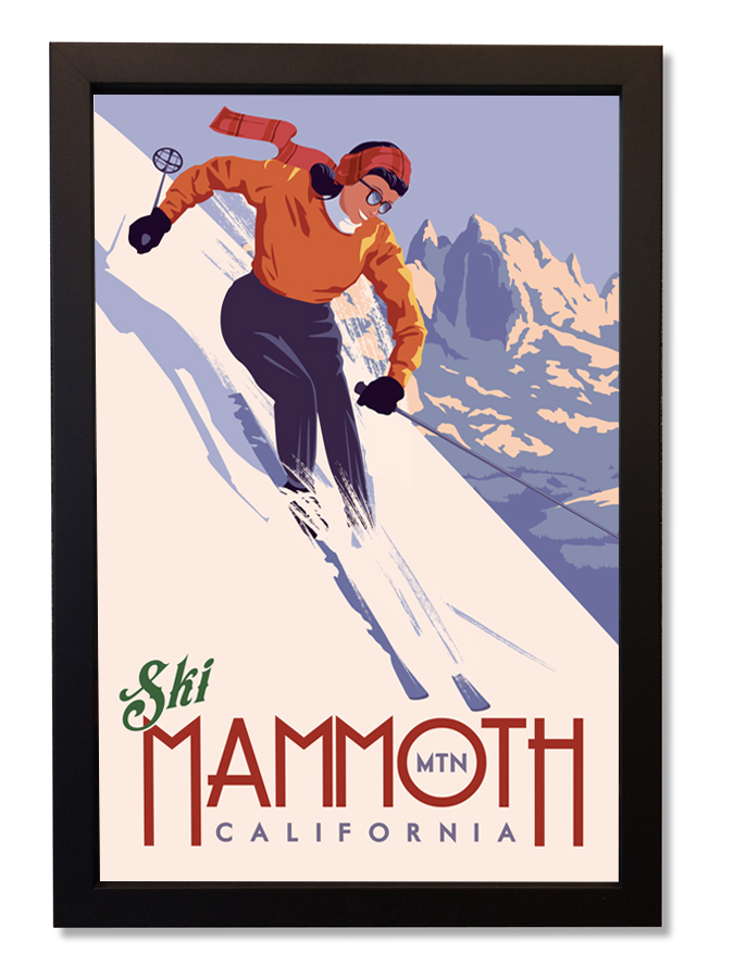
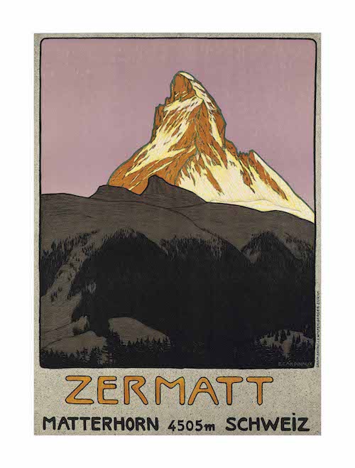
We have had two ski posters by Steve Thomas of Lake Tahoe and Utah on display in our gallery and just released his third which depicts the beautiful Mammoth Mountain in California's Sierra Nevada.  With the new release we wanted to look back and recognize some of the incredible, authentic art deco ski and winter travel posters that are still making headlines today.  Christie's, a globally established art auction house, assembled an impressive collection of authentic, vintage winter destinations and ski posters from the 1920s and 1930s.  At their "Ski Sale" event in 2016 some of their best lots sold for record breaking prices and we wanted to show off a few of our favorite vintage posters alongside Steve Thomas' newly released contemporary art deco prints. 

CHAMPERY

Martin Peikert
(1901 - 1975)
Price Realized:  $10,000

GSTAAD

Alex Walter Digglemann
(1902 - 1987)
Price Realized:  $76,900


Ski Lake Tahoe

Ski Mammoth

Ski Utah


Star Wars and Steve Thomas

Star Wars ... if you have a pulse and breath oxygen you've probably seen the movies, have your favorite character, and do "the best" Chewbacca impression. If not, then you're that person who's been asked multiple times by people in disbelief, "Wait, you've never seen Star Wars?!"  Well, the same could be said for the travel poster art of Steve Thomas, America's most distinguished contemporary commercial illustrator. It's hard to step outside and not see something created or worked on by Steve Thomas. Over the years he has produced artwork for America's National Parks, Clif Bar, Disney, and of course, Star Wars.  

Steve Thomas first began creating Star Wars posters in his iconic Art Deco style in 2007. They are witty, strikingly colorful, and perfectly capture the culture of the Star Wars universe. They bring a sense of timeless realism to this fictional world that makes you feel like you could simply plan a camping trip on Endor or catch a cruise to Tatooine on an Imperial Star Destroyer. From the original trilogy to the newest releases he's done it all!

Raceway.jpg
A New Hope.jpg
Melinium Falcon.jpg
Rebel Cola.jpg
Empire Fizz.jpg

All of the artwork is officially licensed with Star Wars and Steve Thomas will once again be attending Star Wars Week at Disney World in January 2018 to sign and share his artwork!


Echo Ski.jpg
Ewoks.jpg
R2D2.jpg
Report Sedition.jpg
Endor_rally_web.jpg
Dogobah Tea.jpg
Jedi Cola.jpg
Dark Side Coffee.jpg
Storm Trooper Academy.jpg
Star Destroyer.jpg
Desert Speeder.jpg
Jedi Unite.jpg
Rolling Droid.jpg
Liberty for All.jpg
Beggars_canyon_web.jpg
 

David Palmer's Paintings bring Summer Sunflower Warmth to Your Home

We're falling head-over-heels for David Palmer's new Sunflower painting!

Sunflowers #5 by David Palmer - Original Painting on Canvas 30"x40" - $3,200

Sunflowers #5 by David Palmer - Original Painting on Canvas 30"x40" - $3,200

Always turning toward the sun, it’s easy to see how this fresh, yellow flower got its name.  While the name is simple, the legends surrounding the sunflower are far from it. 
It's said that the sunflower represents long life and endurance, as it is able to grow during the hottest months of the year.  The Sunflowers bright disposition also awards this flower the honor of representing feelings of adoration, while the strong stem a symbol of loyalty.  For a bright addition to your home, you can’t get much more symbolic than that!  Cheers to always having a bit of Summer Sunflower Warmth in Your Home!

Sunflowers #3 by David Palmer - Original Painting on Canvas 24"x30" - $2,400

Sunflowers #3 by David Palmer - Original Painting on Canvas 24"x30" - $2,400

Sunflowers #4 by David Palmer - Original Painting on Canvas 24"x30" - $2,400

Sunflowers #4 by David Palmer - Original Painting on Canvas 24"x30" - $2,400

Sunflowers #2 by David Palmer - Original Painting on Canvas 24"x30" - $2,400

Sunflowers #2 by David Palmer - Original Painting on Canvas 24"x30" - $2,400